Beauty Pie
Beauty Pie is a ‘members only’ club selling luxury beauty at affordable prices
Project Overview / Customer Problem
A major obstacle for customers is their lack of understanding about paying a membership fee for access to lower prices. Research revealed customers are more inclined to buy a membership if they receive physical products in return. Beauty Pie was often mistaken for a beauty box subscription, so offering products with membership aligned better with customer expectations.
To address this, we proposed including a Kit with memberships, presented as a free membership with a kit. The project had two parts:
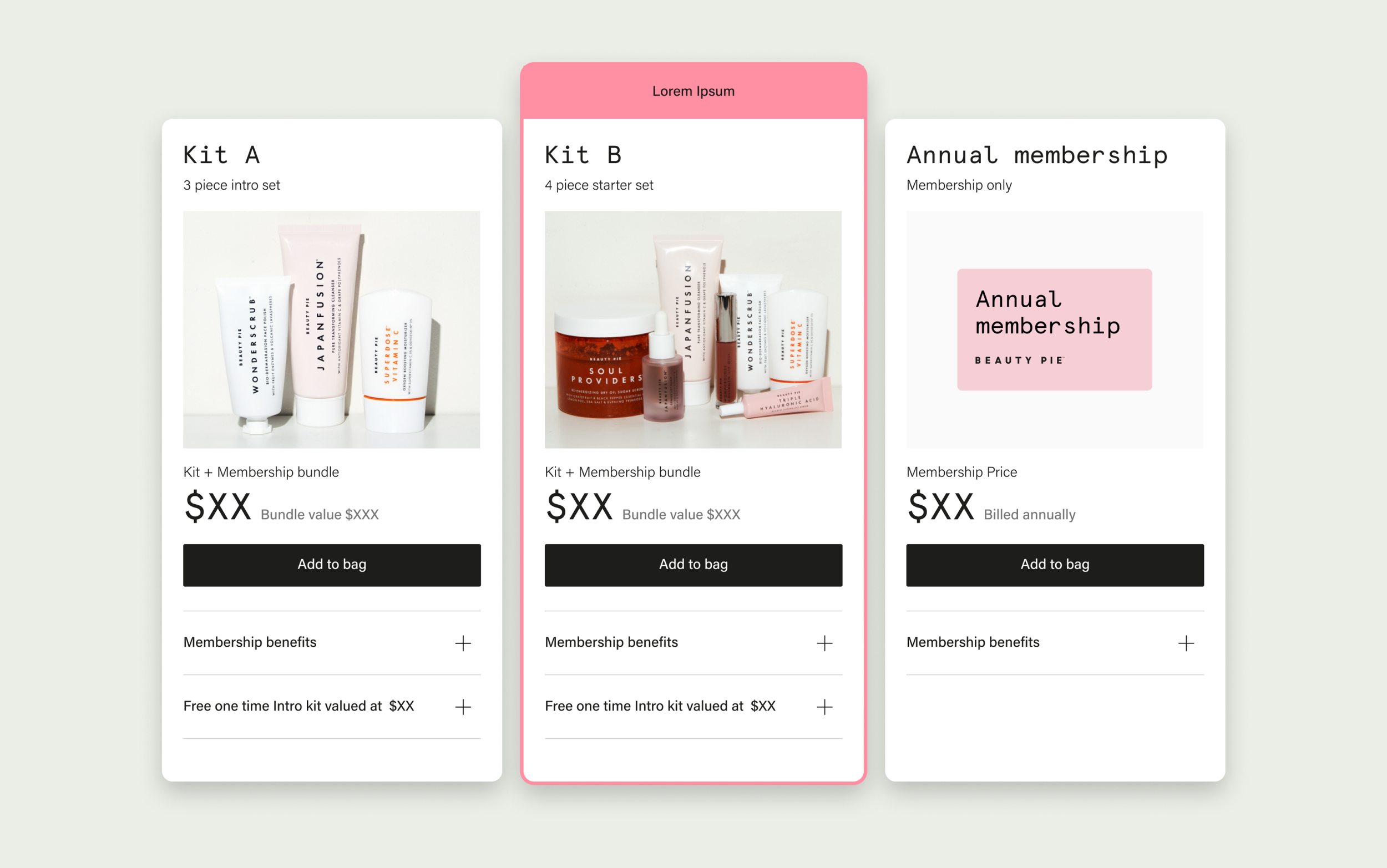
Part One: Integrate kit memberships into the membership cards on the join page,ensuring the CMS system remains flexible for future membership options, as well as not overwhelming users with too much information and too many options.
Part Two: Review the journey from the PDP page to offer kit memberships. Currently, the PDP page only offers monthly or annual memberships without the kit option, potentially frustrating customers. The goal is to find the best way to include the kit membership option in the PDP's add-to-bag journey.
Timeline
5 months
My Role
User Researcher
UX Designer
UI Designer
The Team
UX / UI Design (Me)
Lead Product Manager
Developers
Marketing
Results
Part One: Integrating Kits within the membership cards proved highly complex, requiring flexibility to support future experimentation. The cards needed to accommodate all possible combinations, including promotions, kits, no kits, images, and no images. Despite the challenges, the development of the membership cards into the CMS proceeded and enabled future iterations and experimentation.
Part Two: The kit memberships were not launched due to shifting business priorities, which led to the project being delayed and eventually scrapped, so the kit membership journey from the PDP never went live. Despite this, I was able to conduct successful A/B user testing and found a solution that could potentially be used in the future.
Part one: Membership cards
Current membership card analysis
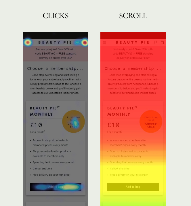
Looking at Hotjar I was able to see 3 main issues with the membership cards as they currently were:
1-We want users to click the "Add to bag" CTA, but it's positioned below the fold. The heat map shows most users don't scroll down, so they miss seeing the CTA.
2-Users were clicking on the yellow roundel. This could be because it potentially appears to look like a button.
3- On mobile devices, the yellow roundel's position causes the text to indent, leading to jagged alignment when the text is longer, making it harder for users to read.
Benchmarking / Best Practice
Adopting a mobile-first approach, I researched the best way to present membership information while ensuring all essential details remain above the fold.
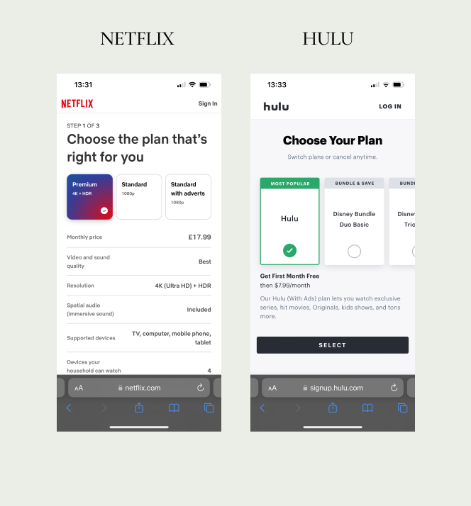
Netflix and Hulu provided strong inspiration in the presentation of their membership options. They feature all membership choices horizontally above the fold, with detailed information displayed beneath each card.
Eye tracking research indicates that people typically read or scan information in two patterns: the "Lawn mower pattern" (left to right, directly down, then right to left) or the F-shaped pattern. Both show users compare information from left to right, making it the most natural way to compare membership cards. (NB. This is considering our UK / US audience base)
Card requirements and flexibility
The primary concern regarding the Membership cards was integrating them into our CMS system for ongoing experimentation and iterative testing. This required ensuring the cards could accommodate multiple potential scenarios for future testing without disrupting the layout of components or combinations. It posed a significant complex challenge. Below are the scenarios I needed to design for:
Membership Price
CTA
Minimum of One membership
Maximum of Six memberships
Selected and Un-Selected states
Kit memberships (Allow for imagery)
Cards without an imagery
Primary & Secondary call out labelling
Membership benefits listed
Kit content Listed
Membership Name
In addition to incorporating all the necessary elements within the cards, I also had to establish rules for developers regarding the cards' behaviour and functionality in various scenarios. Furthermore, I needed to specify which parts of the cards should be editable within the CMS components.
Design
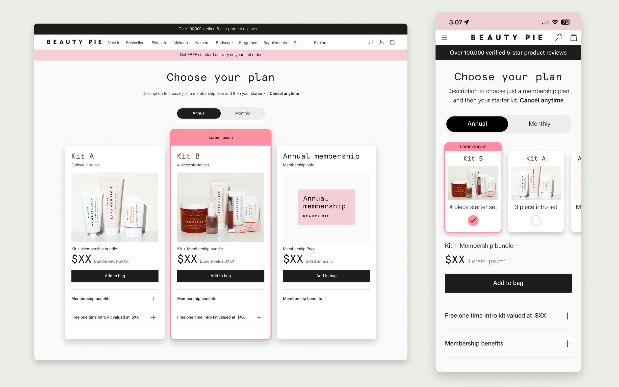
The Result
In user testing the new mobile design cards were successful with users with 86% of users preferring the new layout Vs the original
The development of the membership cards proceeded to be built into the CMS enabling future iterations and experimentation, following a successful collaboration with the development team on the requirements.
Part 2: Kit Membership PDP Journey
The Goal
The goal was to conduct and A/B test comparing two different designs of the PDP page journey for adding a kit membership to the shopping cart. Our aim was to determine if users could understand the process, if the membership options were easily understood, and ultimately, which journey was more effective in terms of user understanding and ease of use.
Benchmarking / inspiration
Option One:
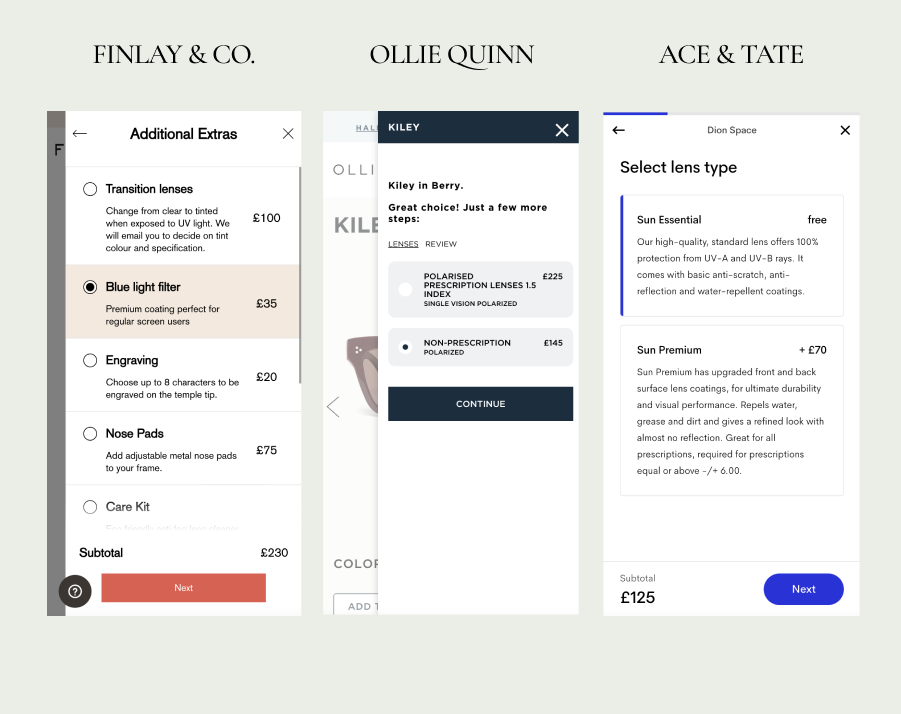
My aim was to have an option that was more attention-grabbing by really highlighting the offering. I analysed how other companies present products on their PDPs without overwhelming users with too much information. A great example of this approach can be seen on optical websites like Finlay, Ollie Quinn, and Ace & Tate. They use progressive disclosure, providing information within a drawer component only when the user needs it, without disrupting the page or journey.
Option two:
I also wanted to test an option that presented the offering as a helpful FYI less intrusive message, maintaining the original user journey while offering an option to explore more membership choices.
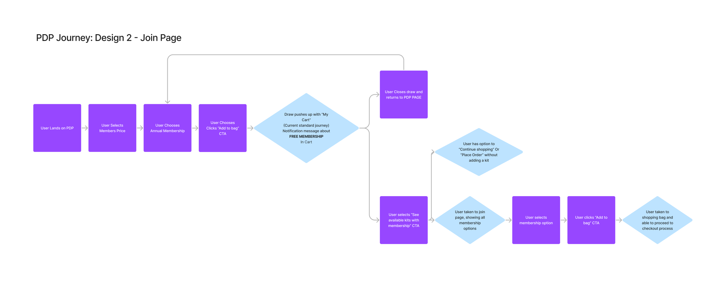
User Journey’s
Designs
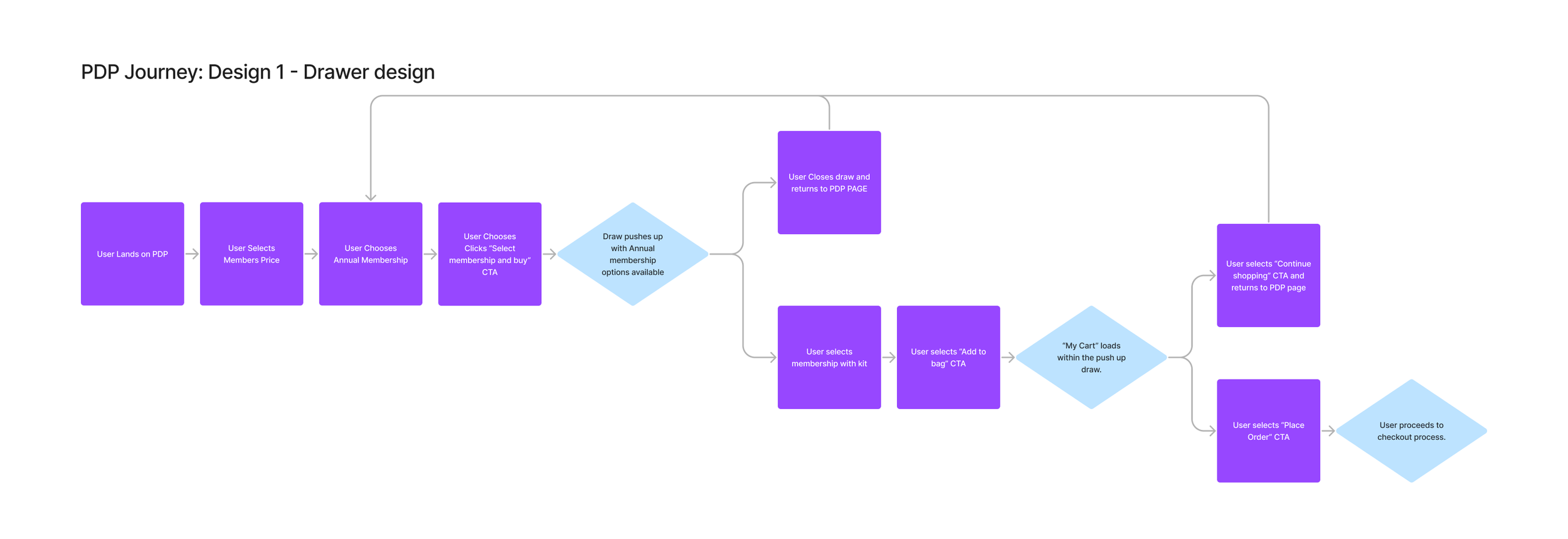
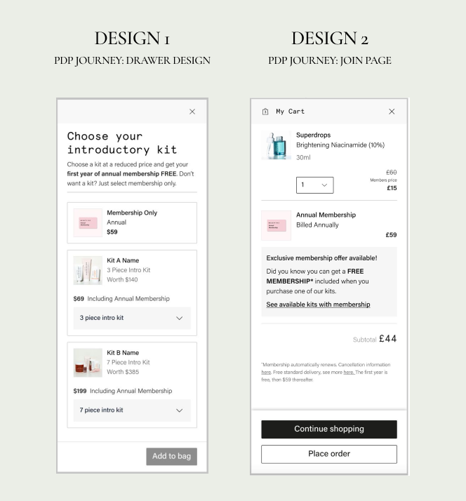
Design 1: Drawer Design
Inspired by optical websites, I placed the membership offerings within a drawer component.
This keeps users on the same page.
This design enables future upselling for both non-members and members through data-driven personalisation.
Design 2: Join Page
I tested a more simplified option, maintaining the current journey.
The membership options are presented as an informational message, allowing users to explore them if desired.
User test Results
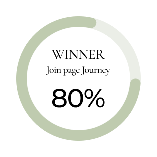
80% of users preferred Design 2.
The join page provides clearer information and more details about what is included.
It was much easier to compare the options.
In Design 2, the offer’s wording and timing created the impression of an exciting deal for the customer, rather than just an add-on.
Users felt a sense of autonomy in making their choice, rather than feeling pressured to select a particular option.
Users seemed more at ease with the experience, as it followed the expected process of adding a product to the bag (matching their mental model). In Design 1 (featuring kits in the drawer), users often experienced a brief pause as they processed the drawer's contents before responding.