Deliveroo
Award winning delivery service owned by DoorDash
MY ROLE
Product Designer
Project Timeline
4 Months
PROJECT OVERVIEW
Optimise the subscription cancellation flow experience
Original flow made little effort to try and retain customers
89% of customers who enter the cancellation flow end their subscription
Analysis performed through Q4 2023 suggested that approx 28% of customers who churned from a Gold subscription had saved more than the value of their subscriptions
From user interviews we know customers don’t always know the full value they are getting from Plus, what tier they are on (even that there are tiers) and what their benefits are.
THE RESULT
24,000 Paying members saved in total
• Savings screen - 2% reduction
in cancellation rates
• Benefits lost table - 0.7% reduction in cancellation rates
• Offers and incentives screen - 3.22% relative reduction in cancellation rate
Goal & Strategy
Aim of the project
Retain as many customers as possible with a paying Plus subscription
Highlighting the value of Plus - Improve messaging around the value of the available benefits, as well as the transactional value that customers have saved in the last month.
Offer alternative experiences - aim to encourage users to explore the benefits of other Plus tiers, with the aim of ensuring that they continue to retain their Plus subscription.
Experimentation - Iteratively experiment with each new screen to learn from data
Create a user-centric cancellation experience - Ensure every screen has a clear purpose and helps customers make informed decisions without adding unnecessary barriers to cancellation.
Original cancellation flow
New flow design
The Plan
Experiment with each screen one at a time to gain a true reflection of the success data of the screen
Due to de-prioritisation there were two screens we were not able to built/ test - Roll up animation screen & Feedback screen
background
Through a very in depth design exploration, thinking about content, accessibility, localisation, re-useable and scalable components. Working closely with and lots of in put from legal, content, engineering, localisation, stakeholders etc I came to this final ideal flow.
Experiments
Experiment 1: The savings screen
Solution
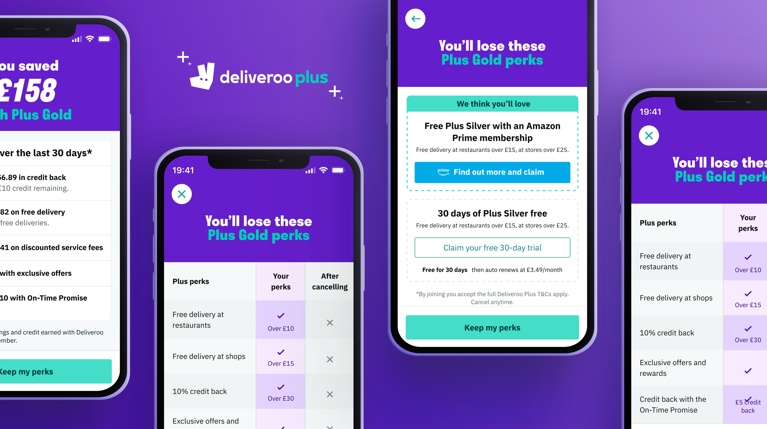
Designed a personalised subscription experience that either highlighted users' savings over the past 30 days when they had exceeded the cost of their Plus subscription, or encouraged users with low savings to switch to a more suitable tier by showcasing alternative plans and their benefits. Particular consideration was given to localisation and varying copy lengths to ensure a consistent experience across the flow.
Design points
30 days savings shown (further experimentation on length of savings to be explored)
Breaking down the savings highlights benefits users maybe didn’t know they had as well as where they are getting the most value from Plus. This also increases trust providing evidence of savings
Result
This change has resulted in a significant 2% reduction
in cancellation rates (share of users cancelling at the end of the cancellation
flow out of those who entered it) across all subscription tiers (77% to 75%).
Experiment 2: The benefits table
Solution
introduction of a “lost benefits” screen that presents a table highlighting key benefits for the current tier that will be lost after cancelling.
Design points
Accessibility focus - Partnered with engineers and a visually impaired colleague to improve screen reader usability, ensuring table content was communicated in a logical, natural-language format rather than as isolated cells.
Results
we observe a significant 0.7% reduction in cancellation rates across all tiers, from 74% in the group exposed to the flow v1 (Cancellation flow with savings screen) to 73.2% in the group exposed to this new flow with the table (V2)
The cancellation flow that presents a new “lost benefits” screen presents a significant 2.4% reduction in cancellation rates across all tiers if we compare it to the old flow (Original); cancellation rates reduce from 76% in the control group (original) to 73% in the treatment group (v2).
Experiment 3: The offers and incentives screen
Problem
High Voluntary Churn: Out of 855k lost paying customers, 574k (67%) chose to terminate their subscriptions voluntarily.
Perceived Value Gap: High churn suggests a mismatch between the cost of Plus tiers and the actual value customers feel they receive.
Lost Retention Opportunity: Approximately 12k Gold subscribers cancel monthly despite continuing to order from Deliveroo within 30 days, indicating they are still active users who have simply opted out of the loyalty tier.
Solution
Improved cancellation flow – Introduced a new intervention screen to engage users before they completed cancellation.
Tier downgrade options – Offered alternative plans, including Prime Silver and Paid Silver, for users looking to reduce costs.
Personalised experience – Displayed relevant plan options based on the user's current subscription.
Goal – Retain users by moving them to a more suitable Plus plan rather than losing them completely.
Design points
I created these cards as variants ensuring they were flexible components and could be amended for future experiments and offers. I kept the cards small ensuring the CTAs would sit above the fold.
Result
Cancellation rates decreased across both key metrics. Users exposed to the new experience were less likely to cancel their subscription, with a 3.2% reduction in cancellation intent and a 1.3% reduction in overall subscription cancellations.
The results indicate that the new experience successfully encouraged some users to exit the cancellation flow and remain subscribed.
NEXT STEPS
Each experiment was successful in the reduction of cancellations. In total from the 3 experiments 24,000 paying subscribers were saved.
The next experiments to come will be adding in a ‘Remind me later screen’, experimentation with savings length of time and contextual placement and messaging outside of the cancellation flow.
New DMCC legislation will likely require a minimal-click cancellation flow. We need to review our recent experiment results to see how we can best apply those learnings to the wider experience.