Earth Funerals
“The natural funeral that gives back” - An affordable alternative to cremation that gently turns bodies into soil.

My Role
UX Designer
UI Designer
Timeline
2 month contract
Business Problem
No structured or scalable design system in place for the marketing website
Design files were fragmented, inconsistent, and difficult to maintain, with duplicated styles and components
Lack of a single source of truth led to inconsistent design decisions across teams
Inefficiencies slowed down design and delivery of new pages and features
Accessibility was not consistently applied, resulting in non-standard compliance in parts of the UI
My Task
Build a scalable design system from the ground up as a single source of truth for the marketing website
Audit and streamline existing styles while defining core design foundations and reusable components
Improve consistency, speed up the design process, and support scalability across breakpoints
Embed accessibility best practices into the system from the outset
Enable faster, more efficient design and development with a more cohesive user experience
My approach
Conducted an audit of existing design files to identify inconsistencies, duplication, and accessibility gaps
Reviewed and refined existing styles (typography, colour, components, patterns) to determine what to retain or remove
Applied the Atomic Design methodology to structure and build a scalable system from foundational elements through to complex components
Defined core design foundations and streamlined design tokens to improve consistency and reduce complexity
Established accessibility standards to guide all design decisions
Built a library of reusable, responsive components designed to scale across breakpoints
Collaborated with stakeholders and developers to ensure alignment with business and technical requirements
Documented guidelines to create a clear, maintainable single source of truth
Foundational Atoms: Typography & Scalability
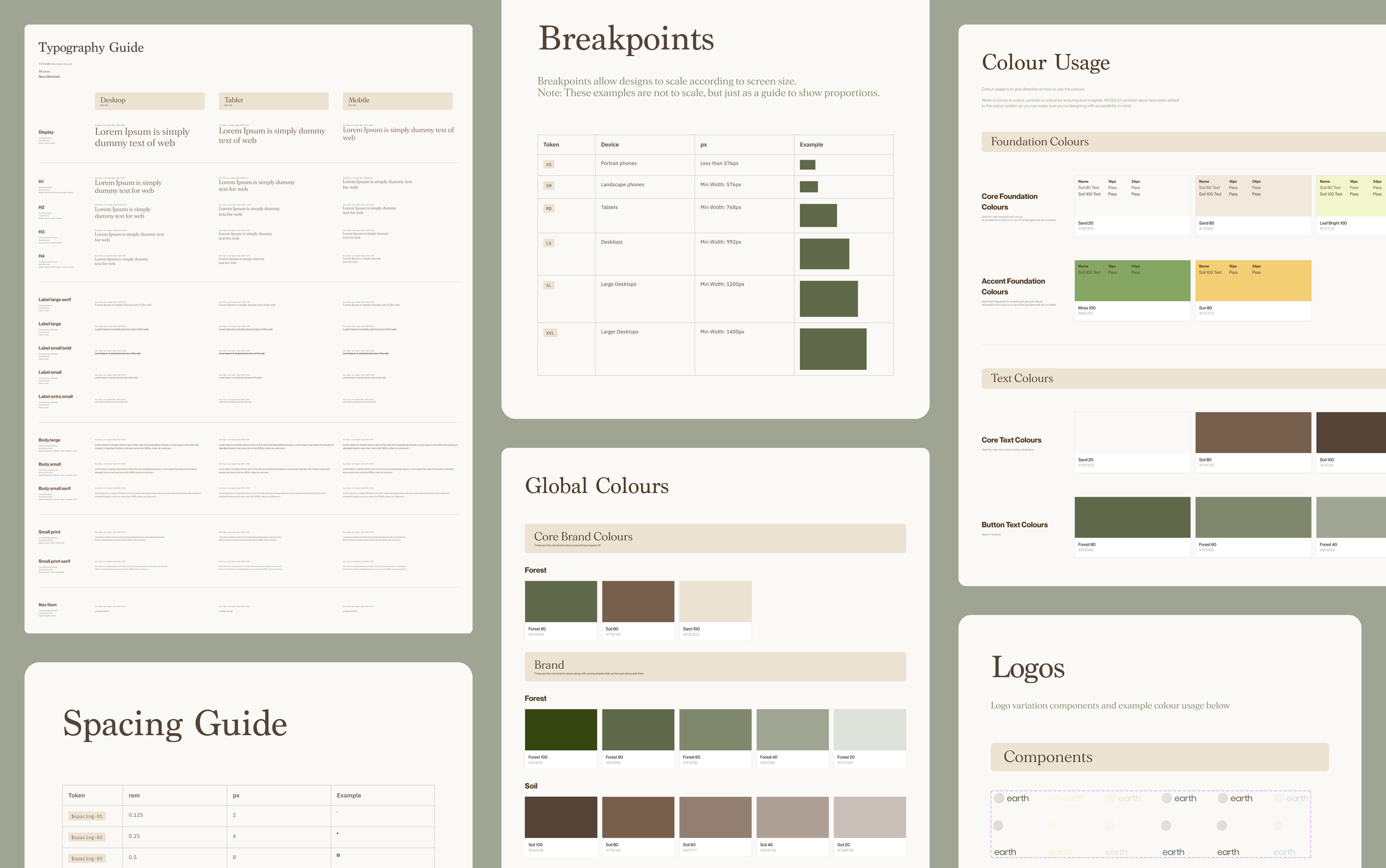
Typography is a foundational atom. Establishing a strong basis here ensures that every subsequent molecule and organism automatically inherits a clean, consistent structure.
1.2 Minor Third Scale: Streamlined styles into a 1.2 ratio. The subtle contrast delivers an elegant feel for marketing while maintaining a reserved, serious, and high-trust tone.
Fluid Responsiveness: The 1.2 ratio ensures text hierarchy adapts seamlessly across Desktop, Tablet, and Mobile.
4px Grid: Rounded all font sizes and line-heights to a 4px vertical grid to eliminate rendering bugs and guarantee consistent spacing.
Semantic Roles: Grouped type by function (Display, Headings, Labels, Body, Small Print, Nav) to align design and engineering workflows.
Dual-Font Pairing: Paired the editorial serif Morion (for impact and headers) with the highly legible sans-serif Neue Montreal (for functional UI and body text).
Foundational Atoms: Spacing, Breakpoints & Grids
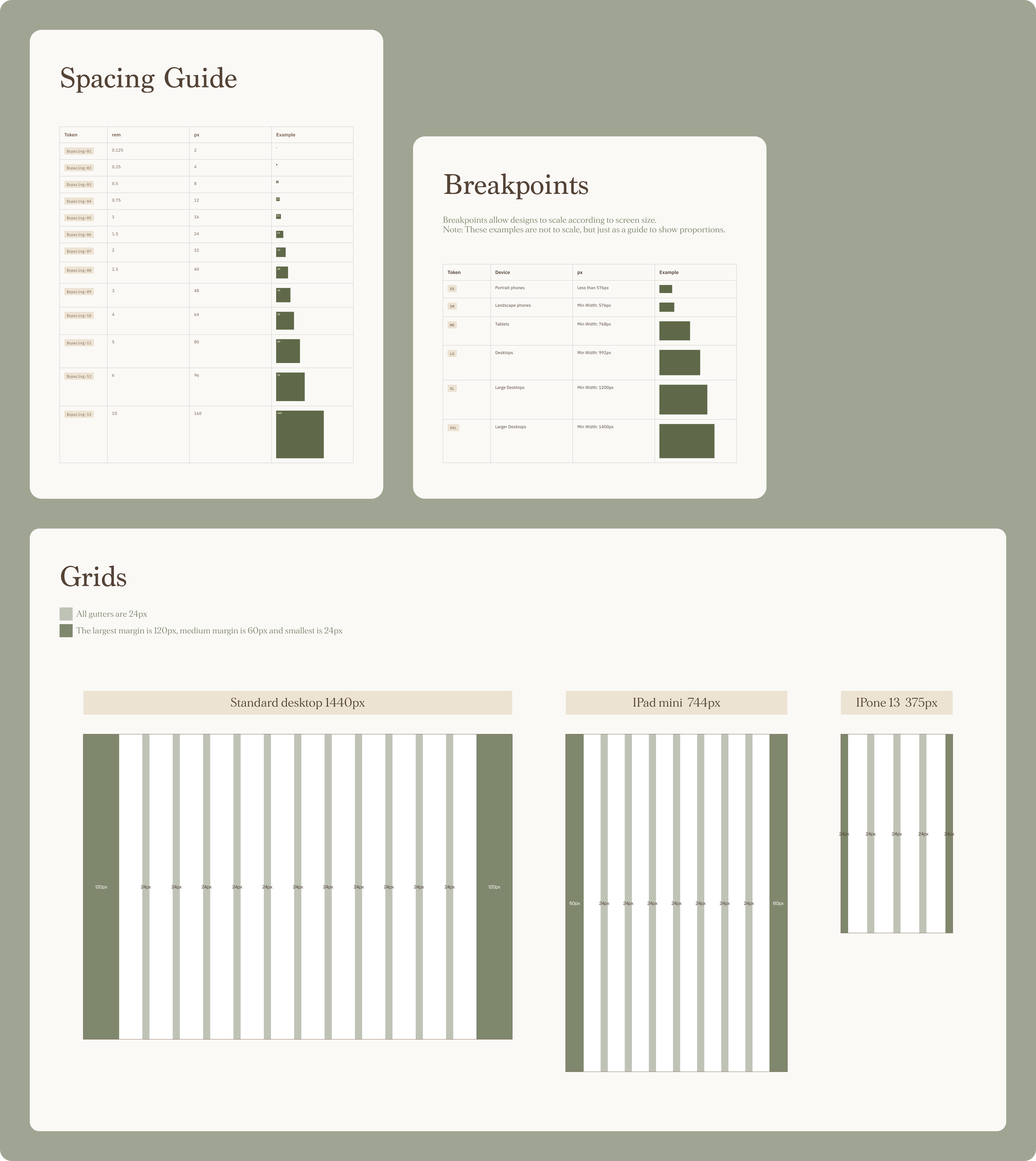
Layout rules hold a design system together. Pairing clear grid boundaries with structured typography keeps every component neat and consistent.
Spacing Scale: Built a 13-tier spacing scale (from 2px to 160px) mapped to
remvalues to eliminate arbitrary margins and padding.6-Tier Breakpoint Strategy: Defined clear device boundaries from XS (<576px) to XXL (1400px+) to guide layouts predictably across all screen sizes.
Adaptive Grid Margins: Established a fixed 24px gutter across devices while dynamically scaling outer margins (120px Desktop, 60px Tablet, 24px Mobile) to optimise readability.
Responsive Column Layouts: Configured standard layouts utilising a 12-column grid for Desktop (1440px), an 8-column grid for iPad mini (744px), and a 4-column grid for iPhone 13 (375px).
Foundational Atoms: Colour System
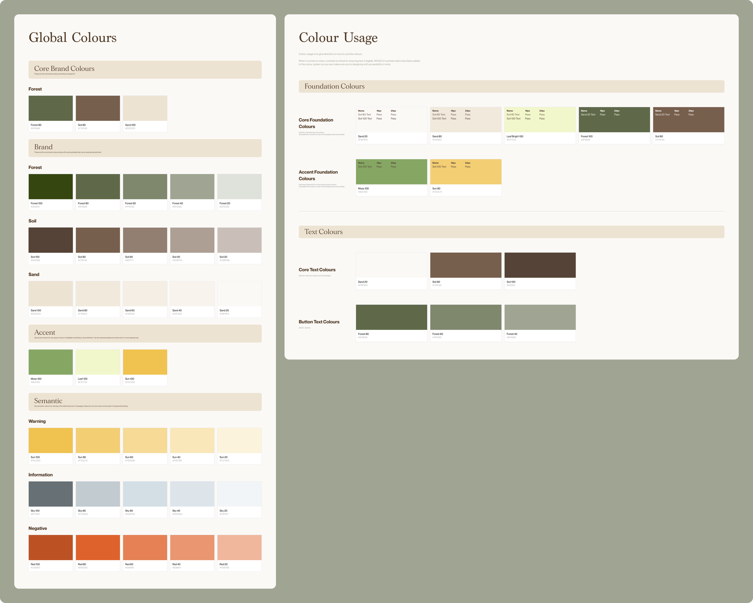
Colour framework ensures the interface remains accessible and aligned with the brand's identity.
Earthy Core Palette: Anchored the brand identity in three core colours—Forest, Soil, and Sand—each scaled into a 5-tier tint system (100 to 20) for layout flexibility.
Vibrant Accent Tones: Introduced targeted accent colours (Moss, Leaf, Sun) to cleanly guide user attention and highlight interactive actions without overpowering the core brand.
Clear System Feedback: Created distinct palettes for Warning, Information, and Negative states to ensure clear, system feedback.
Accessibility-First Pairings: Built the system around WCAG 2.1 contrast ratios, embedding pre-tested text-and-background combinations to guarantee legible 16px and 24px type.
Molecules: Button Component System
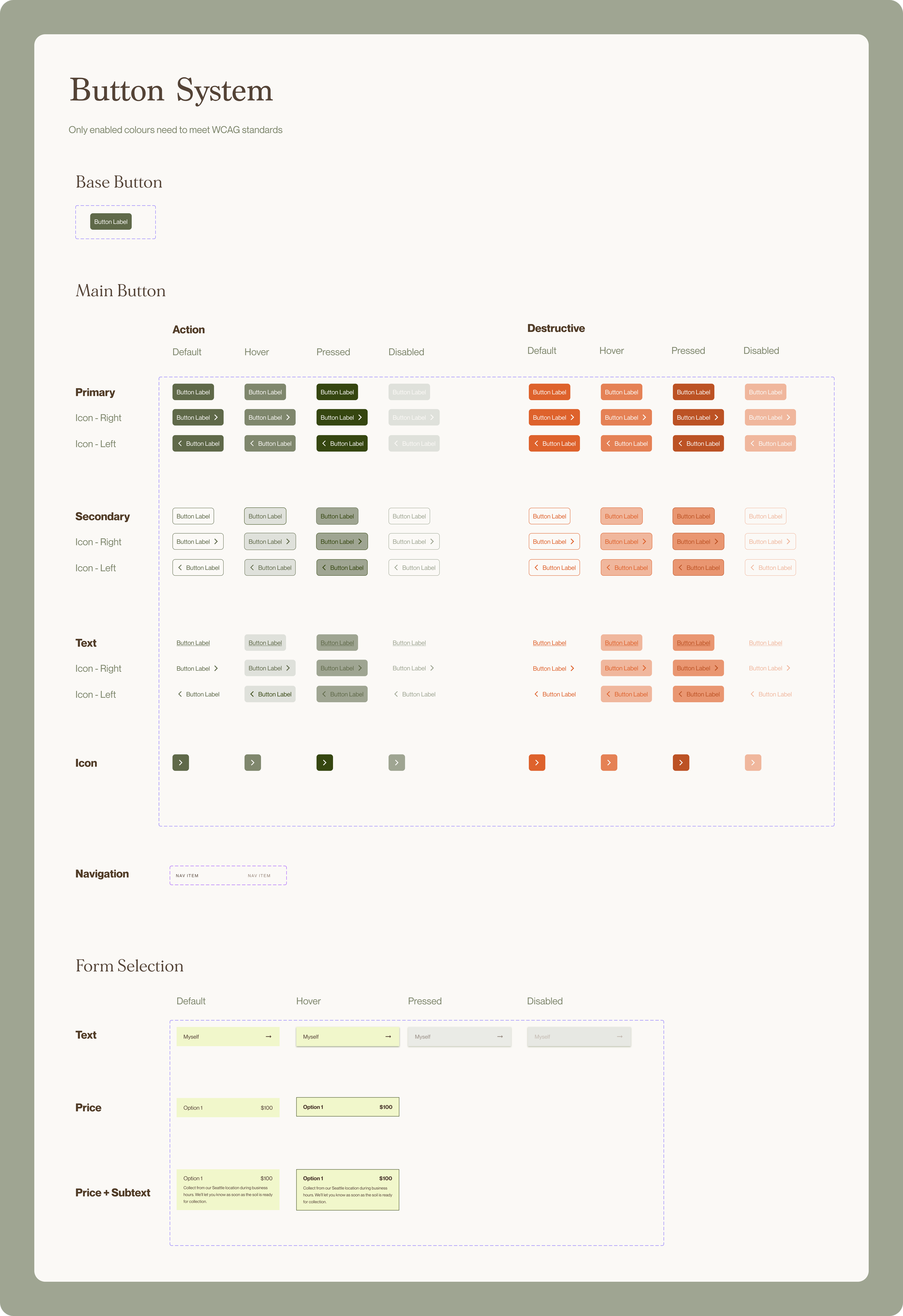
Buttons combine text and colour into interactive parts that guide users to navigate and take action.
Intentional Hierarchy (Action vs. Destructive): Split the main button component into two functional intent paths—standard Action (using brand Forest greens) and Destructive (using semantic Reds)—to prevent accidental user errors.
Flexible Button Styles: Built a versatile layout system by combining different button tiers (Primary, Secondary, Text, Icon-only) with multiple icon placements (Left, Right, or none).
Standardised States: Mapped out consistent looks for Default, Hover, Pressed, and Disabled states so the system behaves predictably whenever a user interacts with it.
Flexible Form Choices: Turned button logic into multi-option selection blocks (Text, Price, and Price + Subtext) using accessible brand colours to handle user choices cleanly.
Molecules: Input Components
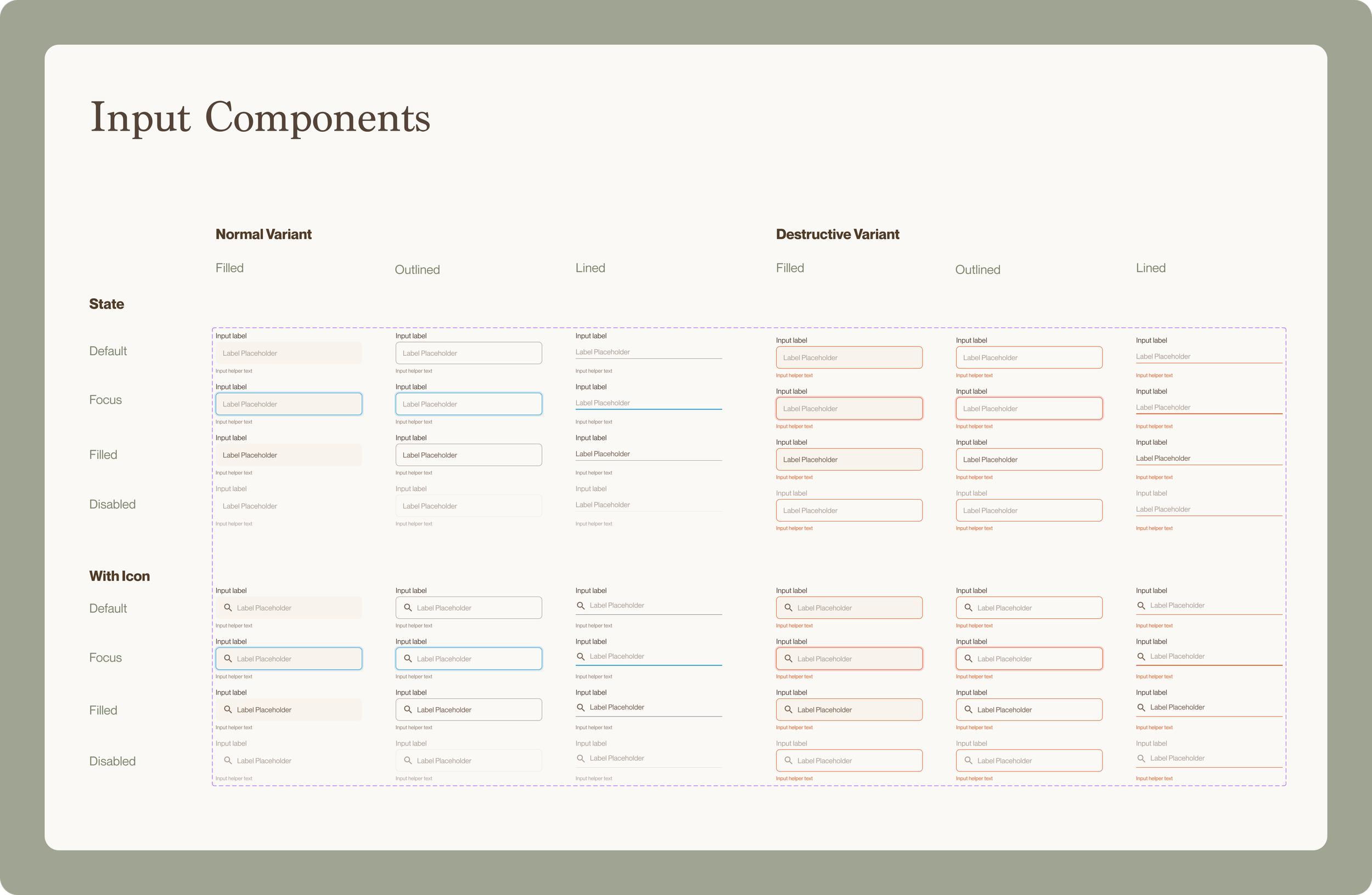
Input fields are interactive molecules assembling text styles, spacing, and colour states. Standardising them ensures data entry feels uniform, predictable, and accessible.
Three Container Styles: Designed Filled, Outlined, and Lined variations to adapt dynamically to different layout weights and user contexts.
Layout Adaptability: Built standard layouts alongside and With Icon variation to support functional UI elements like search bars.
Interactive States: Accounted for full user journeys by mapping Default, Focus, Filled, and Disabled behaviours, using blue highlights for active focus.
Clear Error Handling: Created red Destructive Variants to give users instant, clear feedback when a form has an error.
Organisms: Complex UI Components
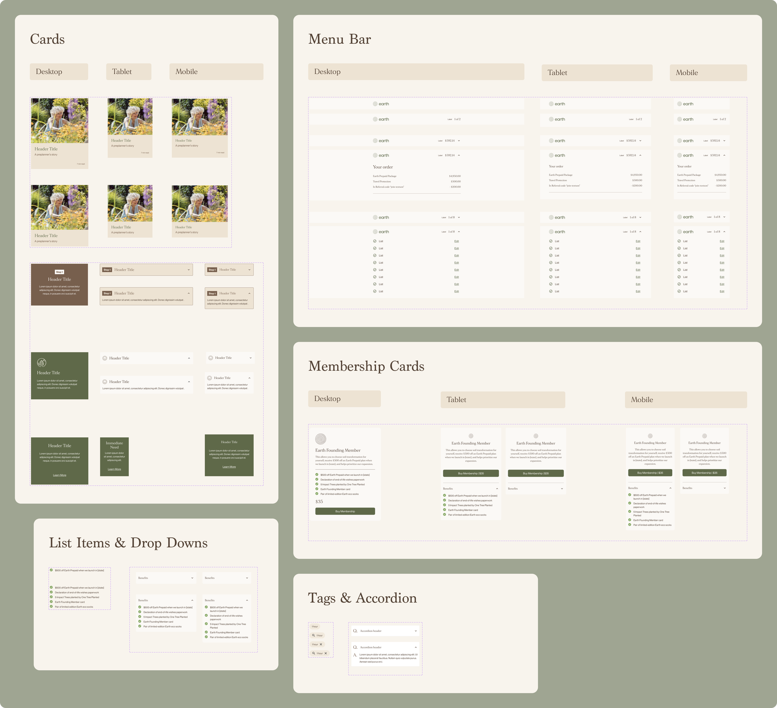
Organisms combine text, spacing, and buttons into larger interface sections. They turn separate components into repeatable layouts that shape the user experience.
Content Cards: Assembled images, headlines, labels, and text layouts into standardised Cards and Membership Cards that scale fluidly across Desktop, Tablet, and Mobile.
Clear Data Displays: Created responsive Menu Bars that combine tags, prices, and dropdown links into neat, expandable lists for order overviews.
Clean Content Layouts: Created repeatable accordions, list items, and filter tags (Tags & Accordion, List Items & Drop Downs) to organise heavy information without cluttering the screen.
Mobile-Friendly Stacking: Optimised layouts across different devices, making multi-column desktop sections stack into clean, single-column lists on mobile screens.
Templates & Pages: Fulfilling the Brief
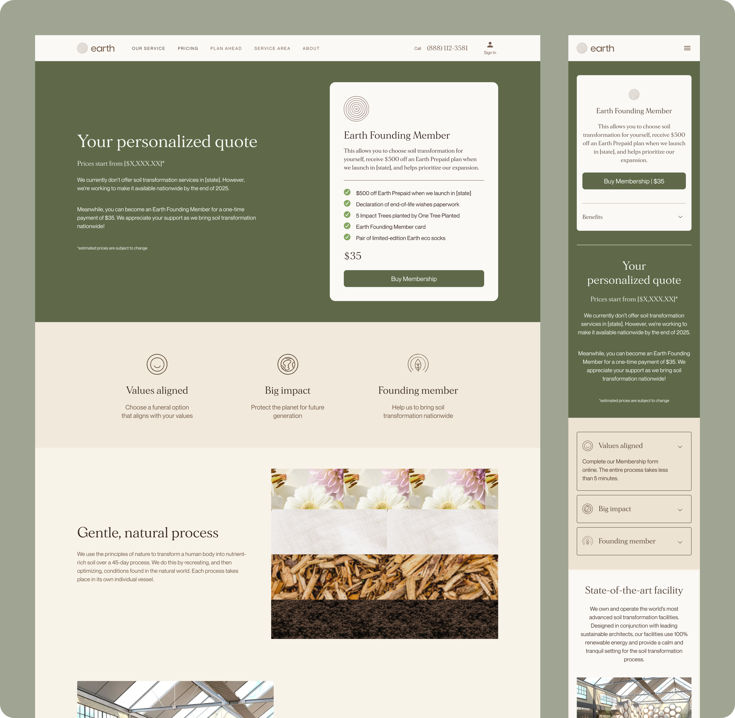
Templates and Pages are the final stage of Atomic Design. They assemble separate pieces into complete layouts, turning design components into real, high-converting websites.
One Source of Truth: Combined approved components into final marketing layouts, proving that a solid token system dramatically speeds up the transition from design to code.
Smooth Fluid Scaling: Used a 1.2 type scale and responsive grids to make multi-column desktop layouts shift smoothly into single-column mobile views.
Built-In Accessibility: Applied pre-tested, WCAG 2.1-compliant colour pairings and typography, securing high legibility across all screen sizes from day one.
Scalable Efficiency: Eliminated design and engineering debt by constructing pages entirely from standardised, repeatable modules, allowing for rapid expansion and visual consistency.