Beauty Pie
Beauty Pie is a ‘members only’ club selling luxury beauty at affordable prices
MY ROLE
User Research
UX Designer
UI Designer
Timeline
3 Months
PROJECT OVERVIEW
The "Refer A Friend" (RAF) initiative presents a significant opportunity for expanding our membership numbers, a key performance indicator (KPI) crucial to our business goals. For our initial rollout, we aimed to establish a fundamental RAF program, allowing us to gather valuable insights from the data and subsequently refine and enhance the program moving forward.
THE RESULT
80% member sessions to / RAF page are sharing the code
Conversion rate for non-members rose to 8.01%
Overall a significant success on the initial MVP design
Continuous itterations from learnings have already begun
Discover / Define Phase:
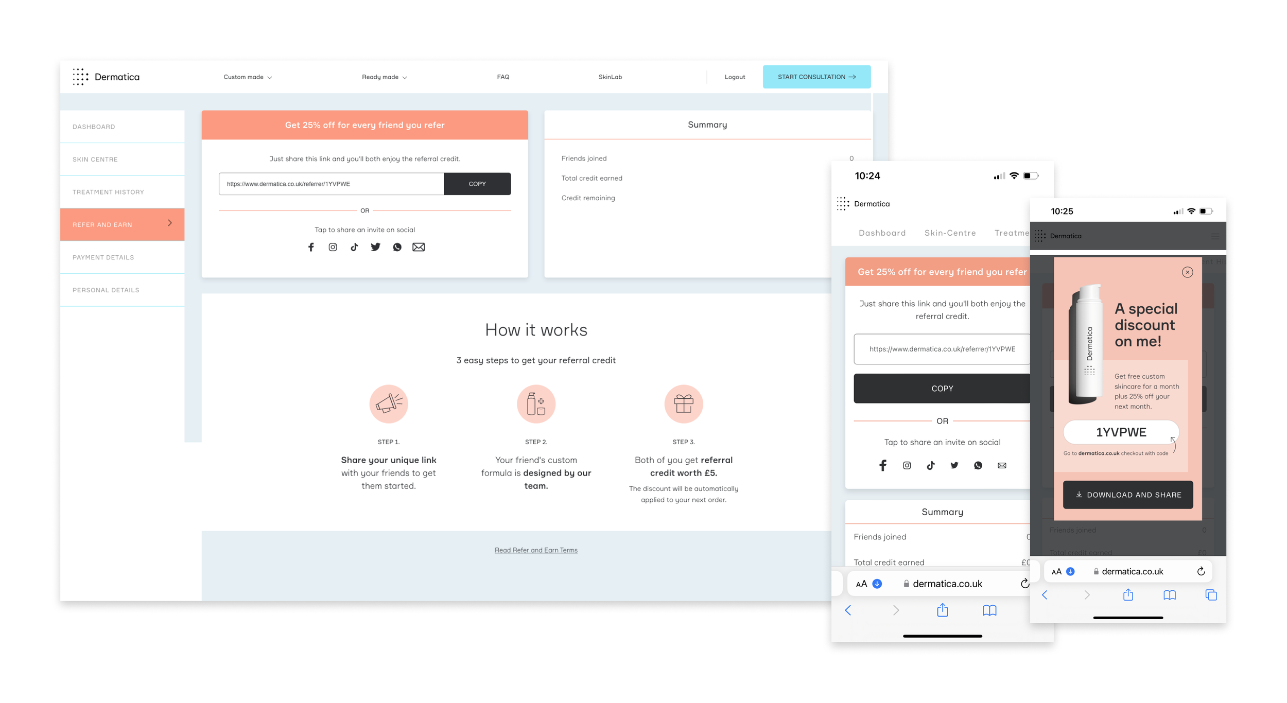
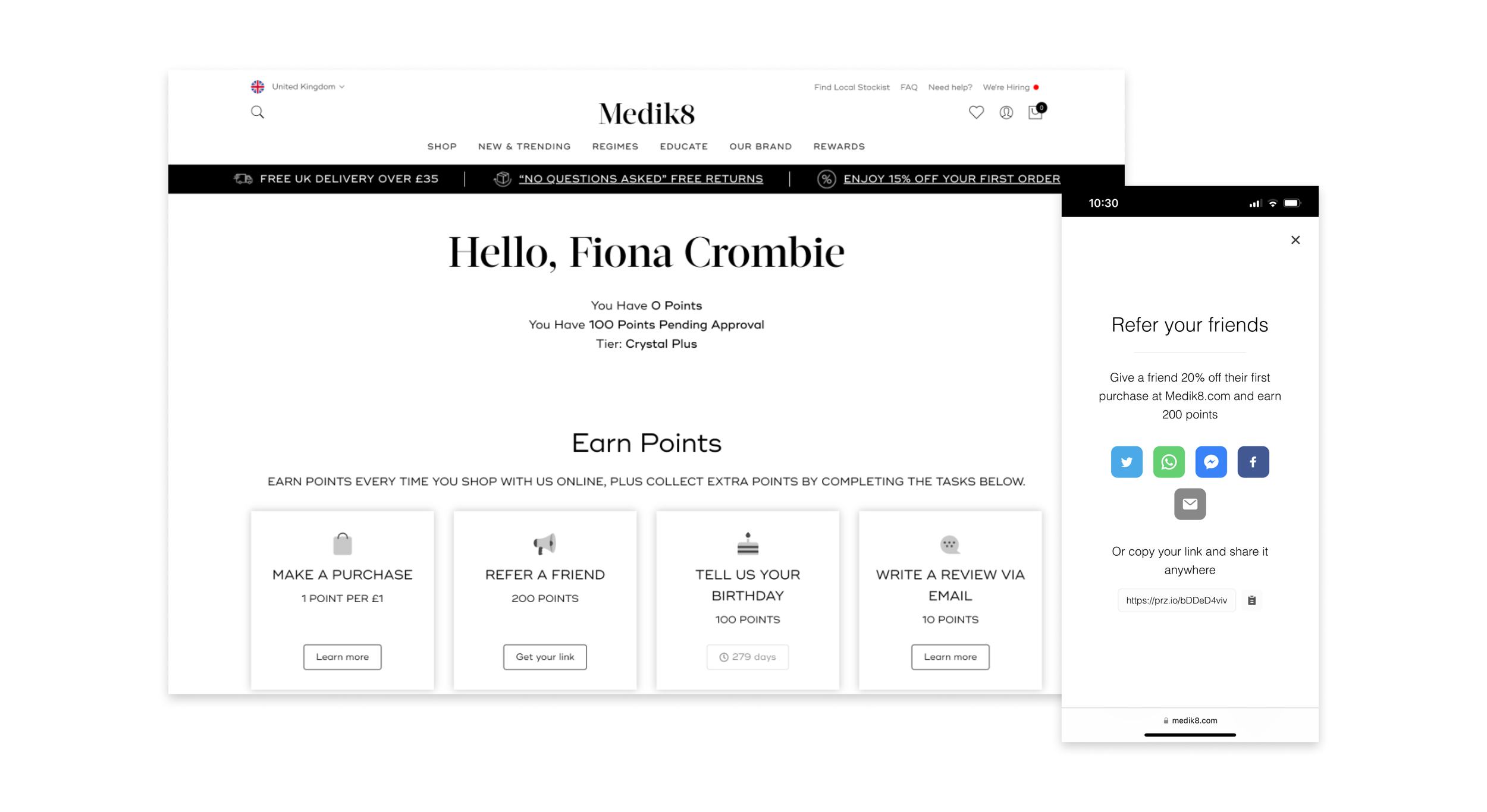
Benchmarking / Competitor Analysis
I looked into various instances of how businesses structure their referral programs.
Typical benchmarks for referral rewards range in discounts (e.g., 10-20% off or £5-£20 off) to store credits, free products, or exclusive perks.
In the context of standard e-commerce websites, a common benchmark is the "give X amount, get X” amount approach.
In more personalised or subscription-based services, the referral offer tends to differ between the referrer and the referee. This discrepancy may arise from the hesitation of potential customers to commit to a membership before experiencing the products.
Copy link, Email, Facebook and Whatsapp are the most commonly used social sharing across both desktop and mobile.
For mobile, the IOS / Android social sharing appears which allows the user to share exactly how they would like through any option available on their personal device.
Referral programs vary in their models, encompassing options such as the standard "give X, get X" program, Loyalty Program, Influencer Program, Extended Offer, or incorporating gamification/FOMO elements.

USER RESEARCH SURVEY
The objective of the initial research survey was to collect insights regarding users' expectations and motivations concerning referral programs. I aimed to comprehend the following aspects:
Their main motivation for wishing to refer a friend
Whether they believed the reward should be solely for themselves or shared with the referred friend
The preferred type and amount of reward they anticipated
Lastly, whether they preferred a cumulative reward or a reward for each individual referral
USER FEEDBACK FINDINGS
The discovered results validate our hypothesis that users anticipate a referral program with a standard "give X, get X" model, where both parties receive an equal amount.
The type of benefit or reward users found most attractive:
UK - 77.8% would prefer a monetary reward
US - 70% would prefer a monetary reward
Users who preferred to share their reward with a friend:
UK - 100% would share an equal reward with a friend
US - 80% would share an equal reward with a friend
Users who preferred a give 20 get 20 reward:
UK - 100% preferred a give 20 get 20 reward offer
US - 90% preferred a give 20 get 20 reward offer
Users who preferred a reward for each individual referral:
UK - 89.9% would prefer a reward for each referral
US - 70% would prefer a reward for each referral
Design Phase
USER FLOW DIAGRAM & CONSIDERATIONS
Based on the initial user research, I developed an optimal user journey for both the advocate and friend. I also took note of any questions for the business and considered design aspects for my own work. My goal was to craft a seamless and straightforward experience for users, ensuring clarity and simplicity.
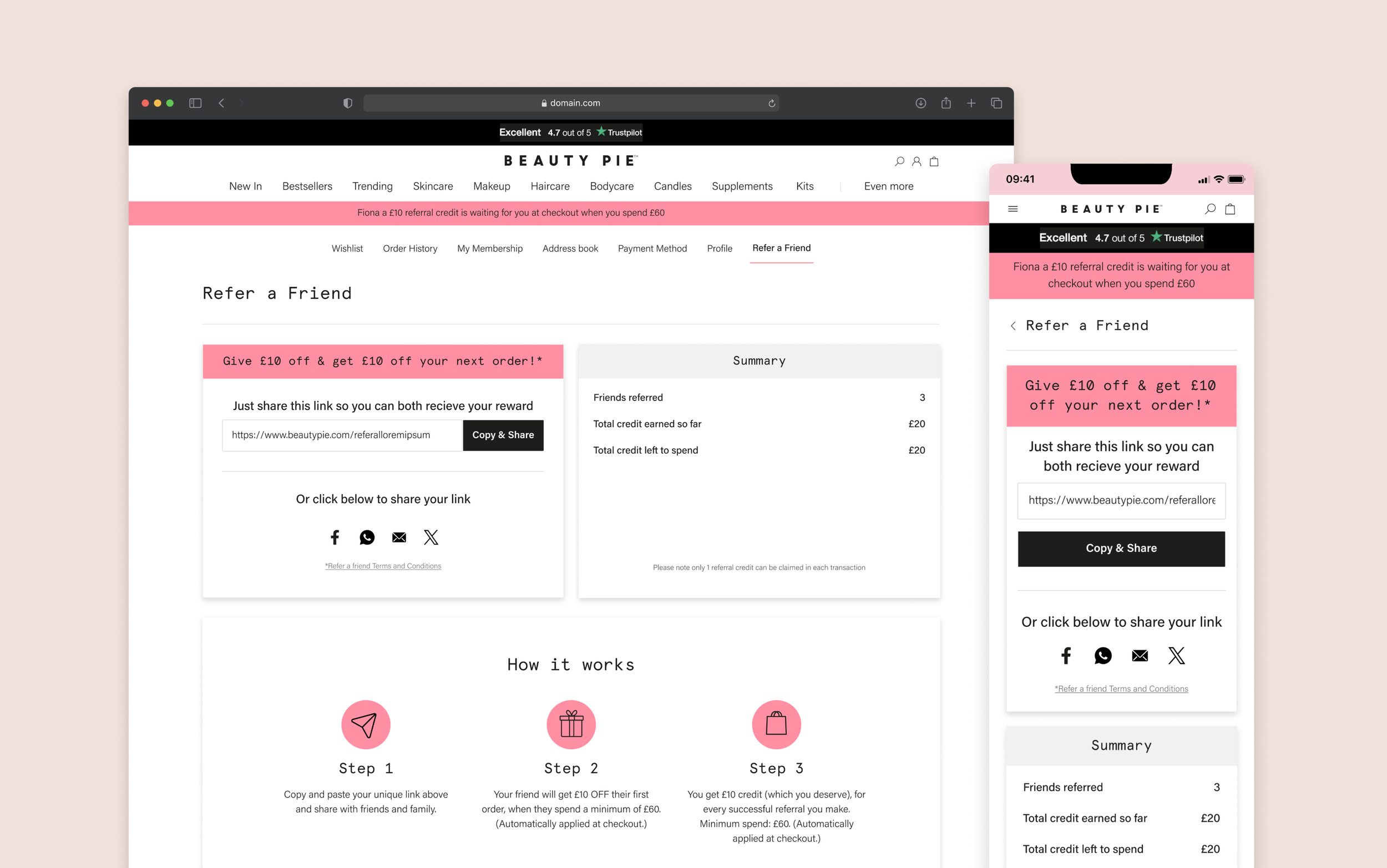
UI DESIGN + MVP LAUNCH
For the initial MVP launch of the design and flow, I established a "Refer a Friend" page within the My Account section to facilitate member referrals. I maintained a minimal and straightforward design. Additionally, I ensured prominent visibility across various touchpoints on the website, with a particular emphasis on the order completion page, anticipating significant traffic from highly motivated customers.
Advocate Journey:


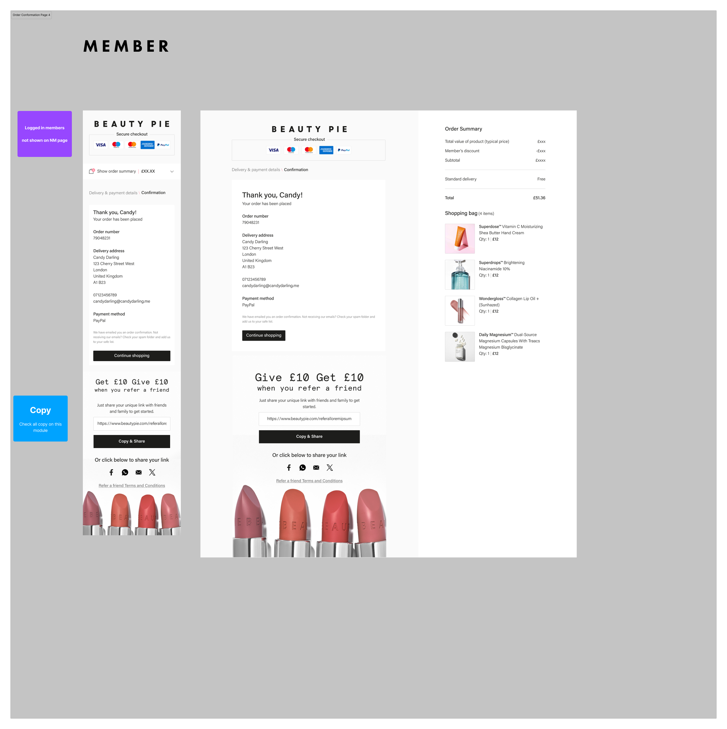


Friend Journey:


Delivery
Ideally, I would have conducted User testing to validate my design solution at this stage. However, due to the business's eagerness to launch the RAF initiative on the site, we opted for an initial soft launch of the MVP design. This entailed refraining from sending out initial communications to a wider audience and postponing the activation of certain components, such as the order confirmation page and the breakout spaces on the Product Landing Pages (PLPs), which tend to garner higher traction.
We were confident that the initial MVP launch of the RAF program was relatively standard and posed minimal risk. To mitigate any potential issues, we conducted thorough QA testing, involving myself, the QA engineer, and the developers. After addressing and resolving all identified bugs, we extended the QA testing to the broader business team before making the design live for customers. Fortunately, this approach was highly successful, as there were no reported bug issues after the launch.
By taking this approach we were able to quickly gather data and learn exactly where improvements were needed.
INITIAL MVP LAUNCH FEEDBACK
RAF was relaunched on 18th Sep 2023 with Talon one as promotion engine and new front end.
Performance - 18th Sep - 27th Oct 2023
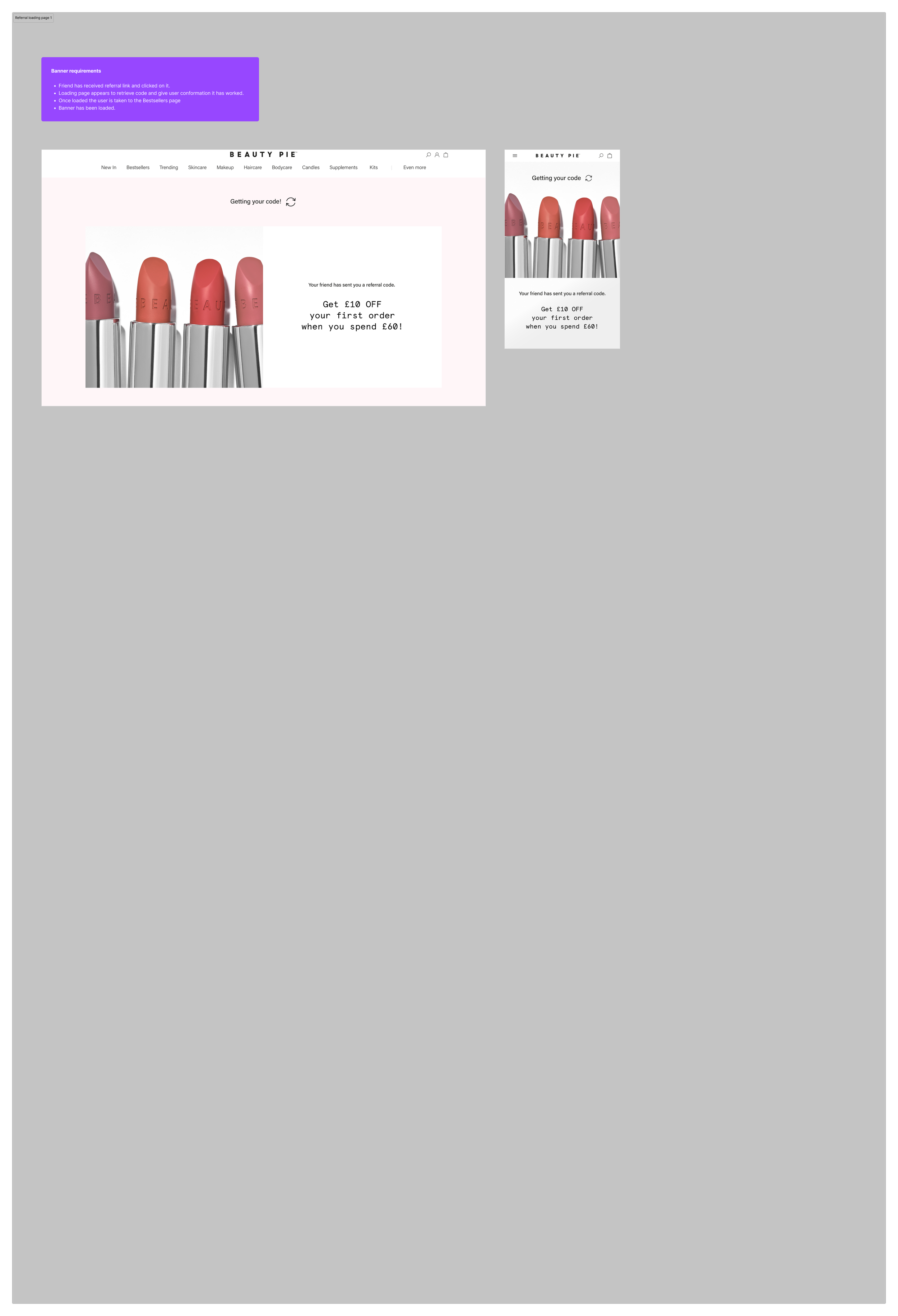
80% member sessions to / RAF page are sharing the code. So RAF from the advocate side appears to be an attractive offer and members are sharing the code. Less interaction comes from the friends redeeming the offer, with a redemption rate of 2.78%.
From these learnings I wanted to explore the friend redemption journey to find out how users are interacting with it, what they think of the offer and if there are any improvements we can make to the journey, to increase conversion rate.
User Test
FRIEND JOURNEY USER TEST FINDINGS
I conducted a user test to identify friction points from the friend's perspective and to comprehend the reasons behind the low conversion rate. The results are outlined below:
Membership is a sticking point:
Some users thought they had to become a member to claim the discount
As users were directly landed on the best sellers page and confronted with member and non member prices, this led to confusion as these are new users who do not know the Beauty Pie business model (They had lots of questions about Beauty Pie)
The banner highlighting the promotional discount was often missed:
A competing pop up banner (10% off your first order) was loaded on entry into the site which caused great frustration initially and then users also confused this offer with the £10 off £60 RAF offer.
The banner was also too subtle and often missed, users would just go straight to looking at the products first and not notice the referral banner.
Users had questions before wanting to shop:
Regarding membership, what is the cancelation policy?
Is there free shipping?
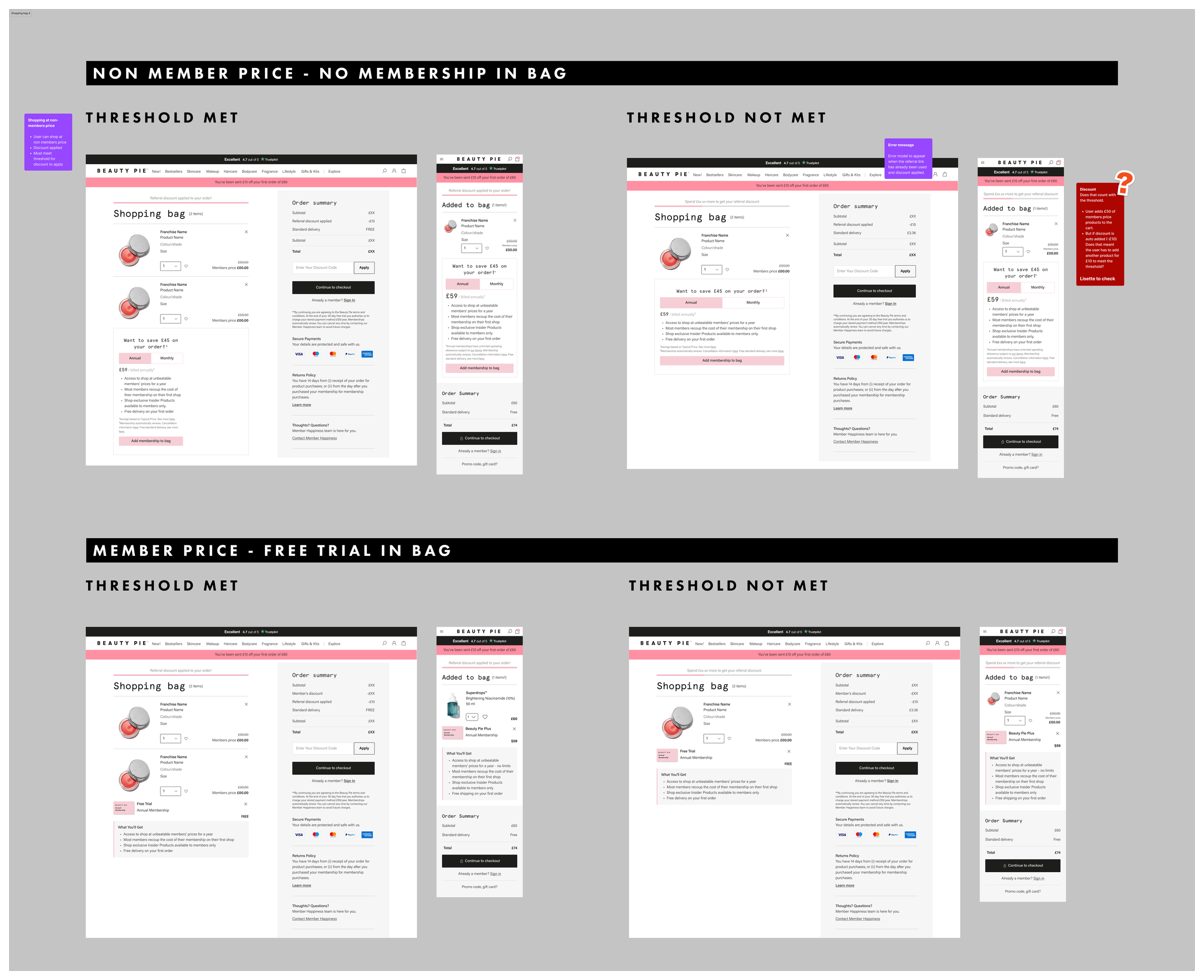
Threshold:
Users were happy with the discount amount, however felt the threshold of £60 ($80) was a lot to spend.
Users kept having to go to the basket to find out how much more they needed to spend
Iteration
DESIGN sOLUTION
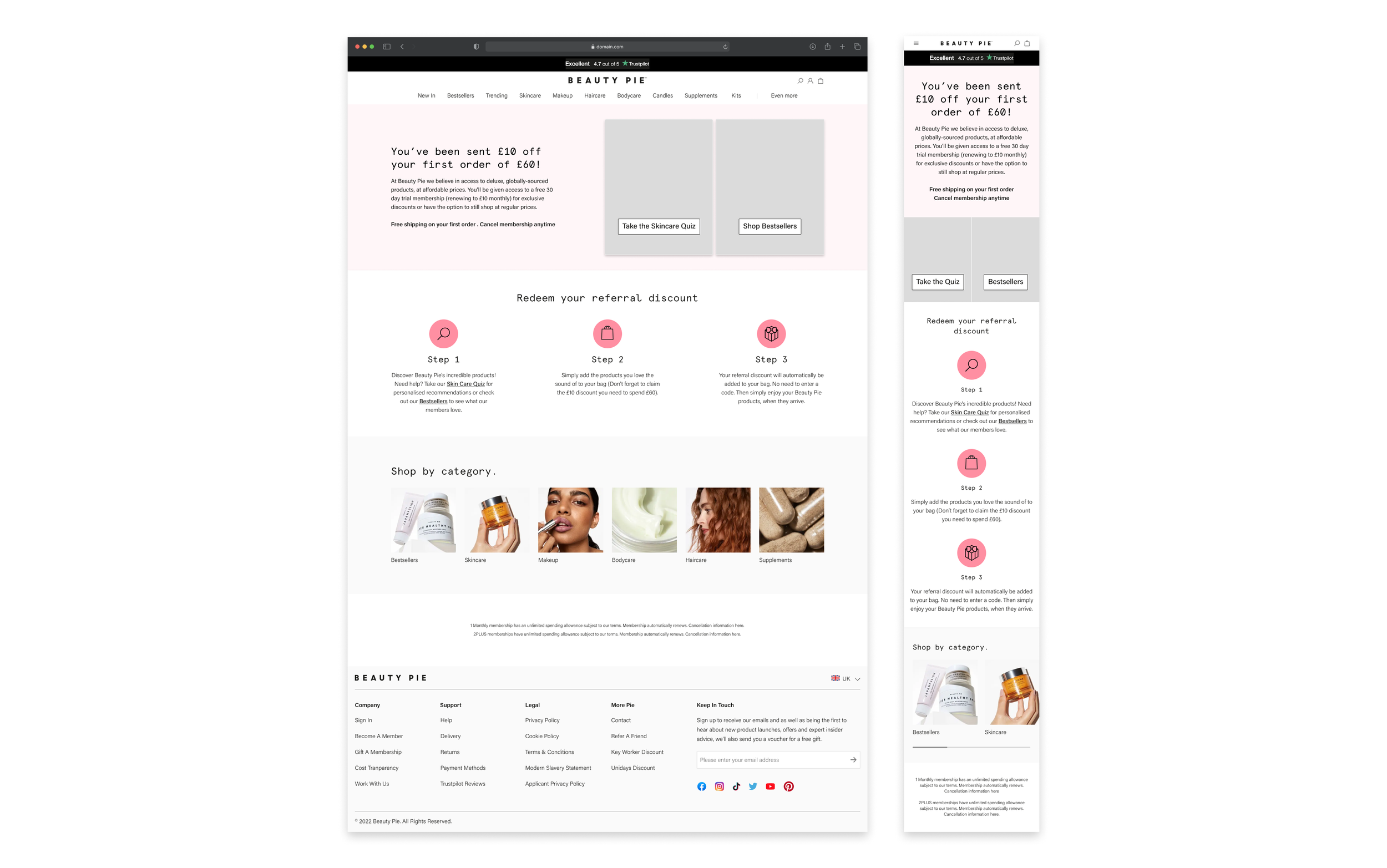
In response to the challenges identified in the initial MVP journey for the friend, I crafted a landing page to address and alleviate most of these issues. This approach enabled the page to exclusively spotlight the RAF offer, which was overlooked in the initial design. The landing page presented a concise overview of the business model with minimal text, informing users that they could enjoy a 30-day free trial membership (renewable at £10 monthly) or continue shopping at non-member prices. Clear communication was maintained about free shipping on initial orders and the flexibility of cancellation at any time.
To enhance the shopping experience for first-time users, I provided options to explore Bestsellers or, for those seeking additional assistance, take the skincare quiz—a proven method for achieving high conversion rates. Additionally, I incorporated a straightforward step-by-step section guiding users on how to redeem their discount.
To aid users in tracking their spending progress toward the required threshold while shopping, I integrated a progress bar into the mini cart. This ensures the remaining amount needed is easily visible with each added product, eliminating the need for users to leave their current page.
Validation
USER TESTING DESIGN VALIDATION
Results from user testing found the new design was successful in answering the questions and friction users were experience in the initial MVP journey.
Interestingly the main friction point now is the threshold amount, see results below:
US Users (Offer $20 off when you spend $80):
67% of users moderately agreed the offer compelled them to want to shop
33% of users strongly agreed the offer compelled them to want to shop
UK Users (Offer £10 off when you spend £60):
17% of users strongly agreed the offer compelled them to shop
33% of users strongly disagreed the offer compelled them to shop
LIVE RESULTS
During the initial week after the introduction of the updated friends landing page, the conversion rate for non-members rose to 8.01%, marking a significant improvement from the 4.72% recorded in the preceding week without the new landing page design. The success of the new design is evident in its ability to address user inquiries, alleviate concerns, and minimise confusion, ultimately leading to a nearly doubled conversion rate.
NEXT STEPS
A proposal to reconsider the RAF offer of £10 off £60 has been submitted to finance and the business.
Communication about the RAF offer will be intensified to enhance its promotion.
Another iteration we plan to test involves introducing either a RAF widget or incorporating it into the main navigation to increase visibility.