
Introduction
Overview
Simulate is an extension that is available to be integrated into any potential clients sports books. It allows their customers to place virtual bets on soccer events that are found on the clients sports book.
The Problem
Now Simulate is in a position that it’s ready to be sold, we need to create a marketing website for potential clients to find out more about simulate and encourage them to see the benefit of integrating Simulate into their company.
The current design needs to be re-looked at, it provides very little information about what it is, what is included and no information on who the company is and their values. It needs to feel more legitimate and give any potential future clients confidence in the product and what it’s about. There is currently a lack of personality, and we are very limited on imagery we can use within the website to make it feel more engaging rather than just text.
For the proposed “Meet The Team” section, not everyone wanted photographs of themselves, that would mean we would also need to hire a professional photographer to take them. So, I needed to explore other ways in which we could show the “Meet The Team” section.
My Task
Gather information from the stakeholders to find out exactly what they want to include in the marketing website, and what selling points they felt were important to push.
Lead the way in finding a way to organise the information received from the stakeholders and finding logical groups, which would lead to natural sections for the website.
Research and think of other content that should be included in a marketing website and why.
Suggest to the content writer information that needs to be included.
Wireframing for both Desktop and Mobile.
Think of a solution to the lack of imagery available.
My Role
Gather all information needed for the content
Plan structure of the content
Mid fidelity Wireframes
High fidelity wireframes
Illustrations
Timeline
3 Weeks to gather all the information, plan the structure and wireframes, along with creating all the illustrations.
Skills
Empathise - Research
Define - Affinity Diagram, Content Planning
Design - Wireframing, Illustration, Website and adaption for Mobile
Prototype - Flow of the website
Tools
Google Hangouts
FigJam
Figma
Research / Define
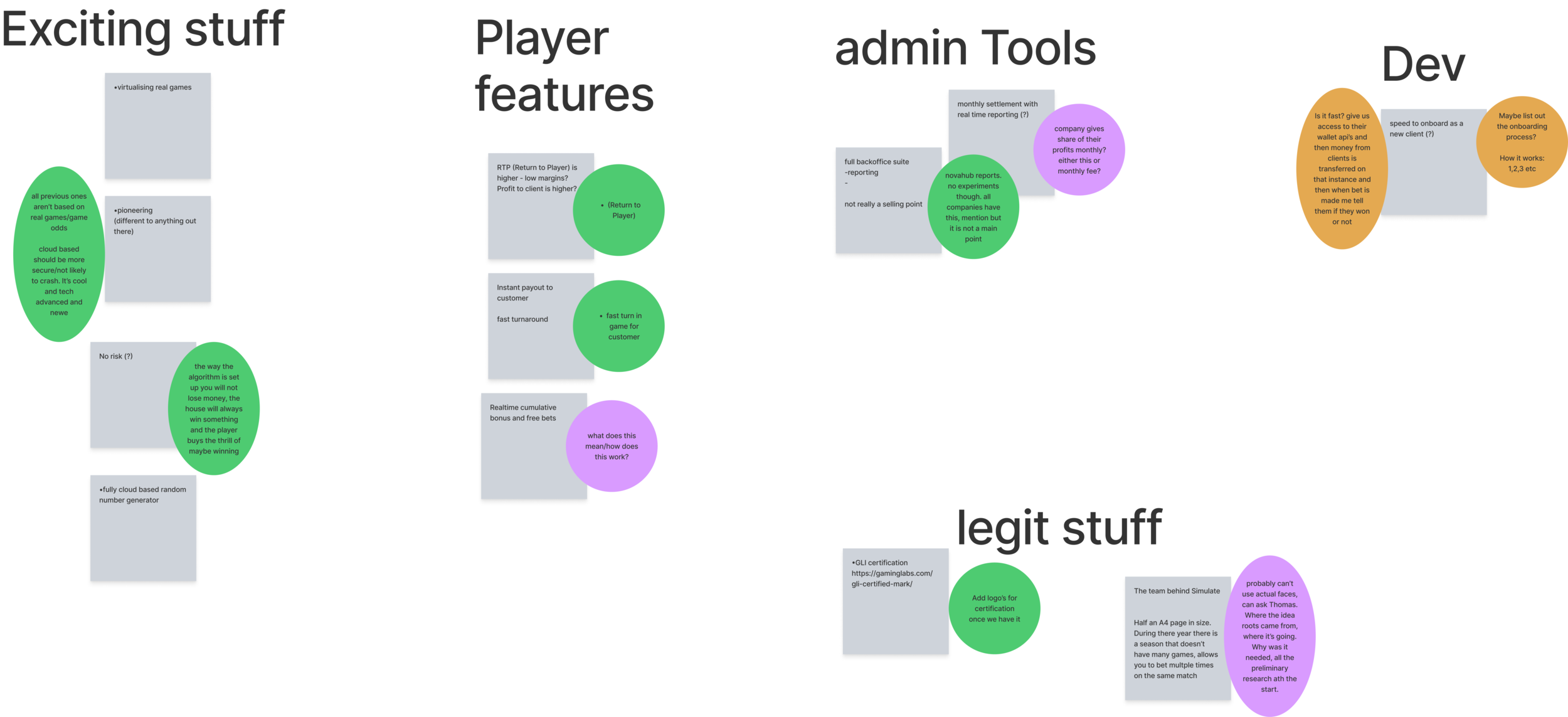
To find out exactly what the stakeholders wanted to be included in the new Simulate marketing website, we held a stakeholder interview where we found out what they felt were the main selling points of the product, what should be included along with making possible suggestions of what we felt could be included.
Once we had gathered the information and jotted it down on (virtual) Sticky notes, we needed to make sense of how to organise the required content. I suggested that as a team we could conduct a quick affinity diagram, and organise the notes in to logical groups, giving each a heading. (As seen in the image to the right).
Now we had the basic sections for the website, I researched and gathered inspiration on what exactly could be included in these sections, and how the content could be laid out. This was to help with the design of the wireframes, along with giving direction to my team member who would be writing the content for the website.
Design
Wireframes
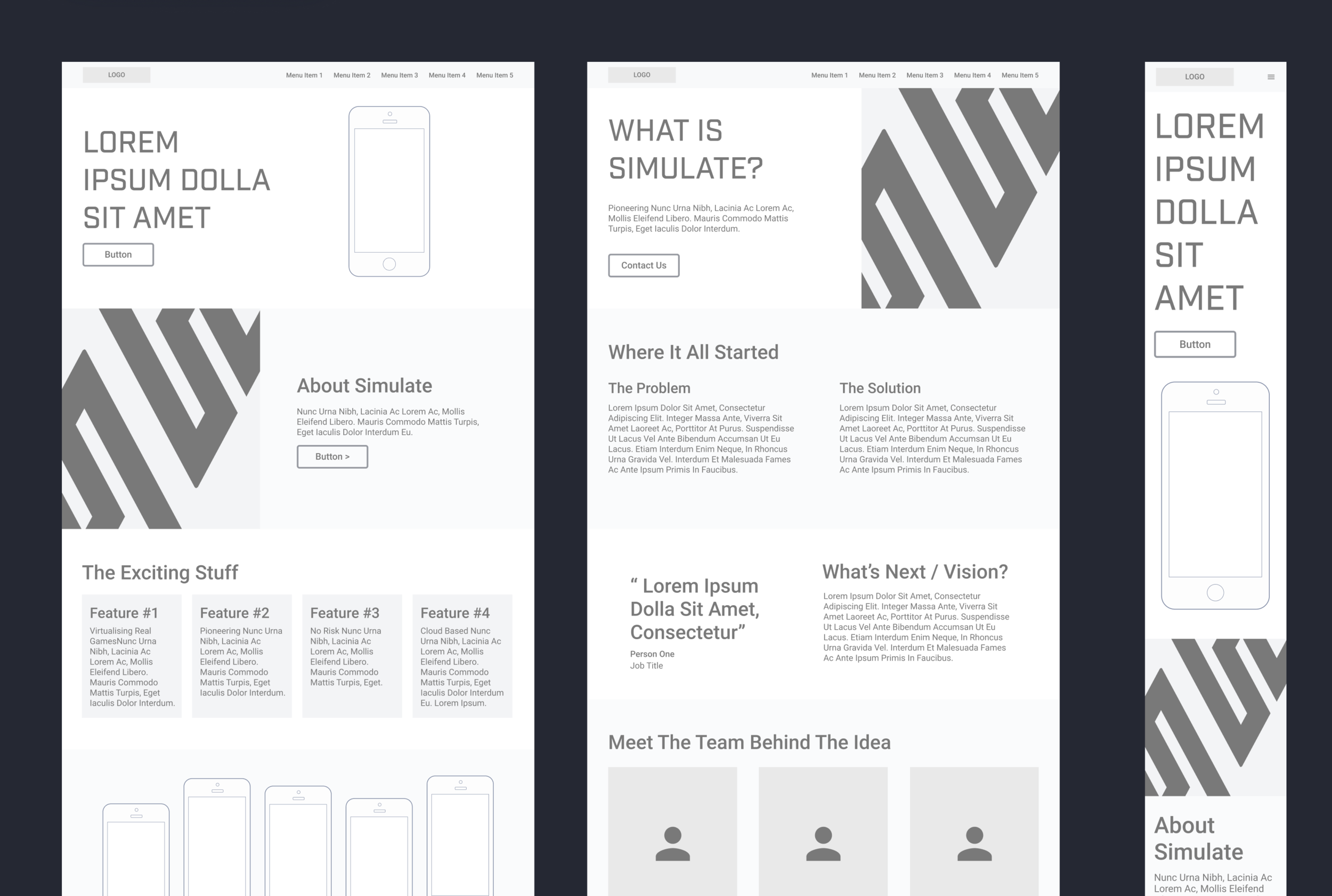
To create the wireframes shown in the images to the right, I thought about the content that needed to be included and what would be the most clear and concise way to display it. I thought about the mobile design in conjunction with the desktop, and how the content would stack, or in the case of the menu how that could work on mobile to make it more user friendly. I considered whether any of the content would be too small or also too large, meaning the page would be too long and the user would have to scroll too much. After trying out multiple sketches and variations, I settled on the final design shown in the wireframes.
At this point I held a meeting with the stakeholders, to get early feedback on their thoughts and feelings about the wireframes so far, and the suggested type of content we would like to include.
To see the wireframes, please click the image on the left or the button below.
Illustrations
While creating the wireframes I was thinking about what kind of images we could include to bring interest to the website, as there were very little assets we could use, along with how we could show images of the team members. To have photos of the team, we would need to hire a photographer, and some of the team members weren’t keen to have their photo taken or be on the website.
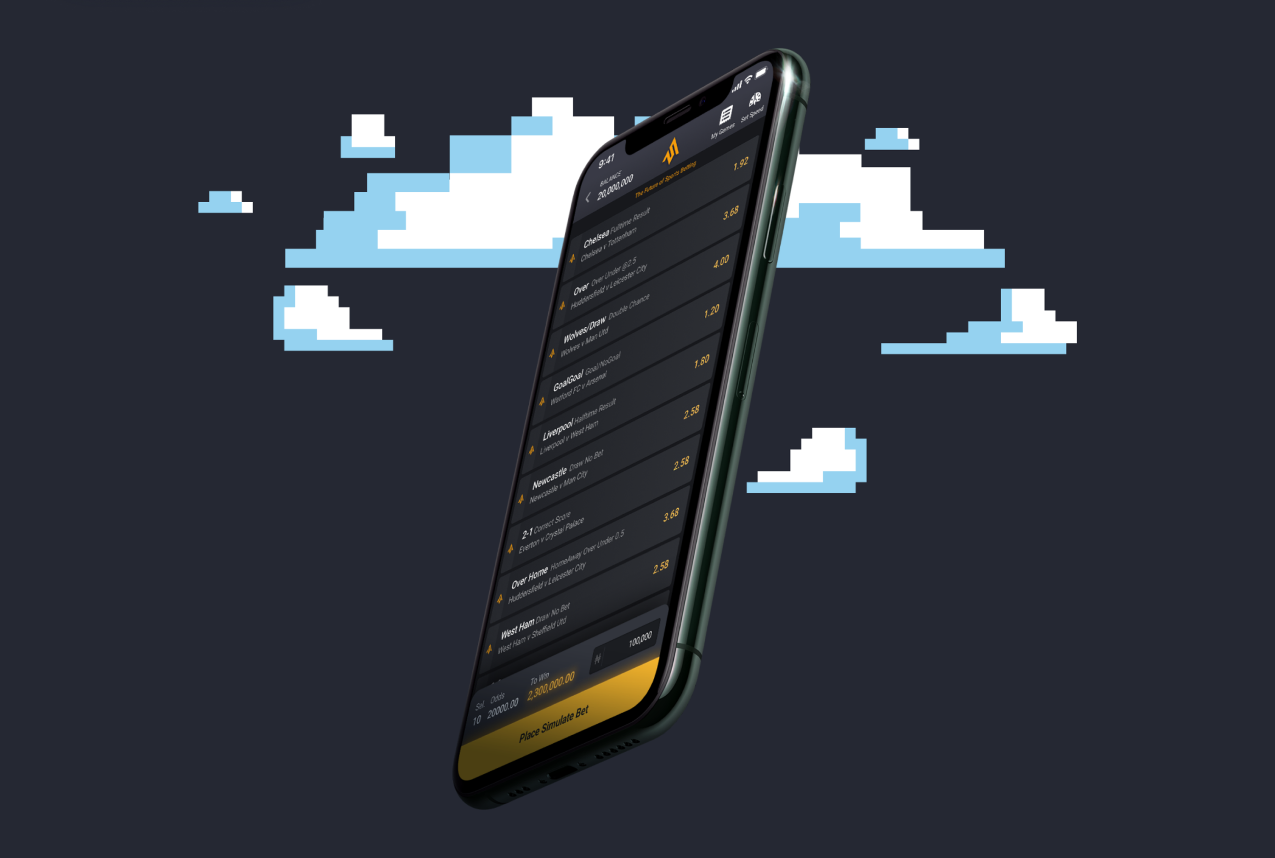
To solve this problem, I suggested creating 8 bit pixel style illustrations of the team members and this could also be carried out through the website, which can be seen on the mockups. The idea of the 8 bit pixel style came from the idea of simulate having a game like feel, keeping it light hearted and also later down the line we could create mini games within Simulate using this style.
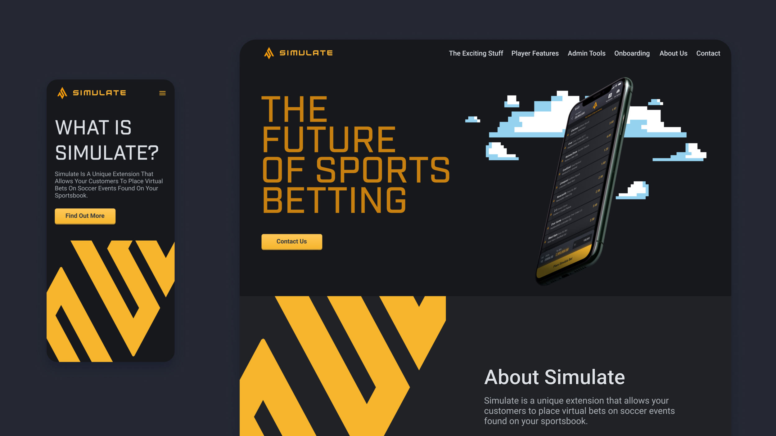
Mock Ups

To create the mockups I branded the wireframes using the Simulate colour pallet, typography and logos. This was to keep the branding on point and make Simulate very recognisable. When creating the illustratiions, I also tried to keep to the colour pallet where possible, so they blended in well with the rest of the design.
Prototype
Desktop
I created a basic prototype of the desktop website to show the one page layout and the separate page for the “About Us” section. This also shows the selected state of the menu. I chose to use colour and an underline to show the feedback of the users selection. I considered the accessibility for anyone who might have trouble seeing colours.
Mobile Menu
For the mobile prototype I decided to show how the menu would work as that is the part that will work differently to the desktop version.
I used a hamburger menu in the top right corner as it’s easier for the user to reach rather than the top left. I made it so it took over the whole screen, enabling the use of larger and more spaced out text for each menu item making sure they were centre aligned. This was all to consider the ease of reach for a user holding their phone in one hand and using their thumb, considering Fitts’s Law, where it states it’s faster/ easier for a user to hit a larger and close up target, than one that is smaller and further away.
Conclusion
For the Simulate Marketing website, we set out to develop the current website further including much more information so that Simulate is ready to be sold. My task was to extract the information from the stakeholders, and design a wireframe that would show the information in a clear, concise and easy to read manner. I also needed to think of a solution to the lack of imagery we had and a way to brand the website to make it look more exciting.
Overall this project went incredibly smoothly, we were able to find out all the information that was needed for the website as part of a team, I lead the way in how we could organise that information into logical groups, which in turn made it a lot easier to then design the wireframes and the sections that were needed. I researched examples of other marketing websites, what information was included and how that was laid out. As I wouldn’t be writing the copy, I gave direction on what kind of information could be included in each section to help our copy writer, which also helped her with any other information she needed to find out.
Finally, I pitched the idea of using 8bit pixel style illustration to firstly solve the problem of the lack of imagery we had, and also solve the problem of the team photos. I came up with this idea as we had talked about it initially to potentially use this style in the future for the actual Simulate games. As there was a lack of budget, we are unable to hire an illustrator, this solution meant it’s quite simple and fairly quick for us as designers to create ourselves. It also meant we didn’t need to hire a photographer to take pictures of the team (which some team members didn’t want their photo on the website).
Once the high fidelity wireframes I created were ready and signed off by the stakeholders, I was then able to hand over the design to be created in Webflow. Overall, this project was very successful, and will be put to the test once Simulate is ready to be sold and the website is live.