Introduction
Overview
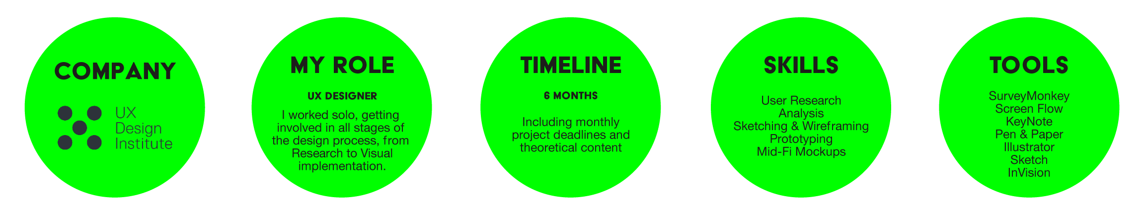
Fly UX is an academic case study which I have done as part of my professional diploma in UX Design. The Brief was to identify positive or negative areas in existing airline booking websites, using a variety of research techniques, and use all the research and findings to create a prototype and wireframes to propose my own design solution.
The problem
The goal of the project was to identify the problems of airline booking websites and design the solutions.
I found that users became frustrated when airline websites are regularly filled with distracting advertisements, too much or too little information and an unclear process which leads to users searching around aimlessly to find what they are looking for.
My task was to find out how can I optimise the airline website booking process to make it a really straight forward and simple step by step task?
Research
Competitive benchmarking
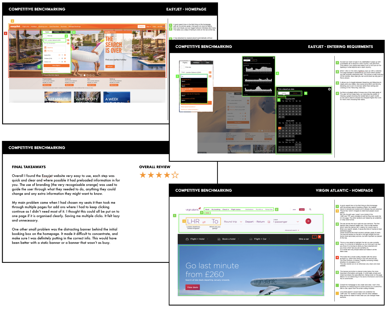
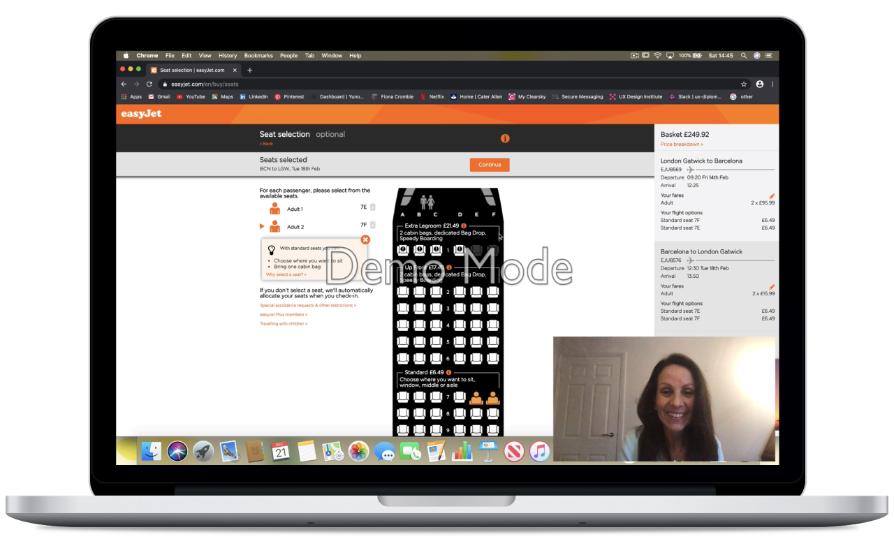
I firstly carried out an in-depth analysis of four competitive airline websites, my objectives were to learn from best in-class websites on what conventions I should follow and emulate. I also wanted to find out any problems that occurred or appeared difficult that I could solve in my own design later on. I chose to analyses 3 airline websites and 1 travel website, which were EasyJet, British Airways, Virgin Atlantic and Citymapper. I went through each of the websites as if i was making a booking whilst taking screen shots of the pages, I then made notes on any positive or negative points that I found. By doing this I was really able to see the patterns and conventions that kept appearing, what areas worked well and not so well, and helped me in what I needed to think about in my own design process.
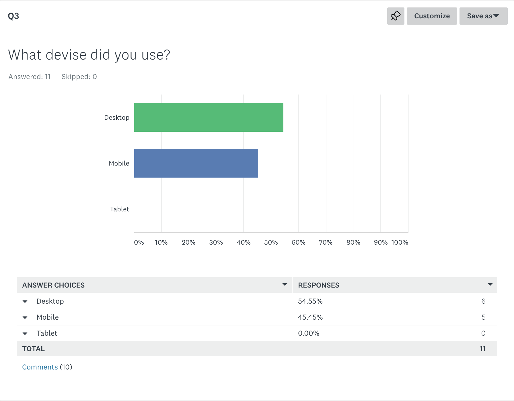
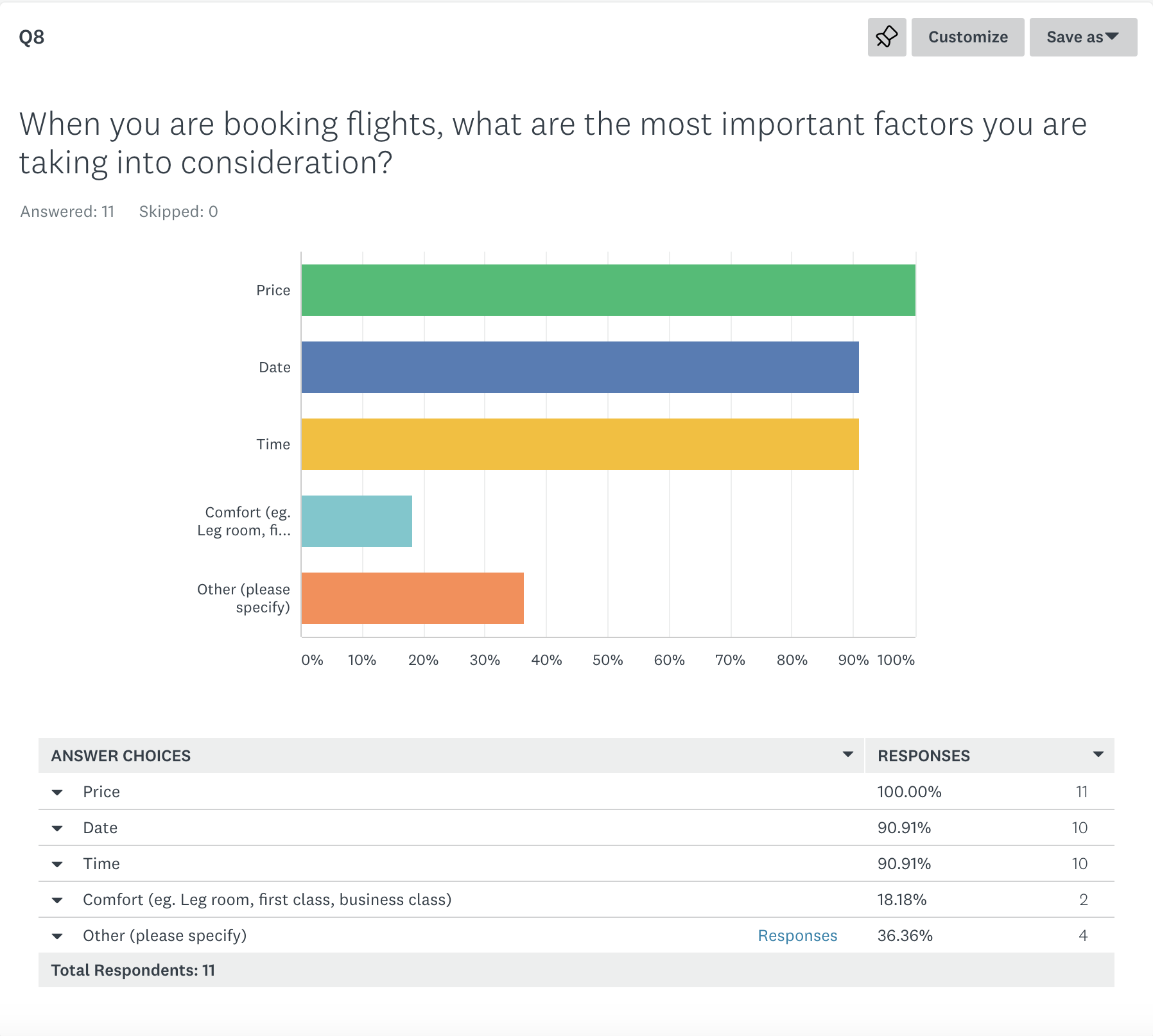
Survey
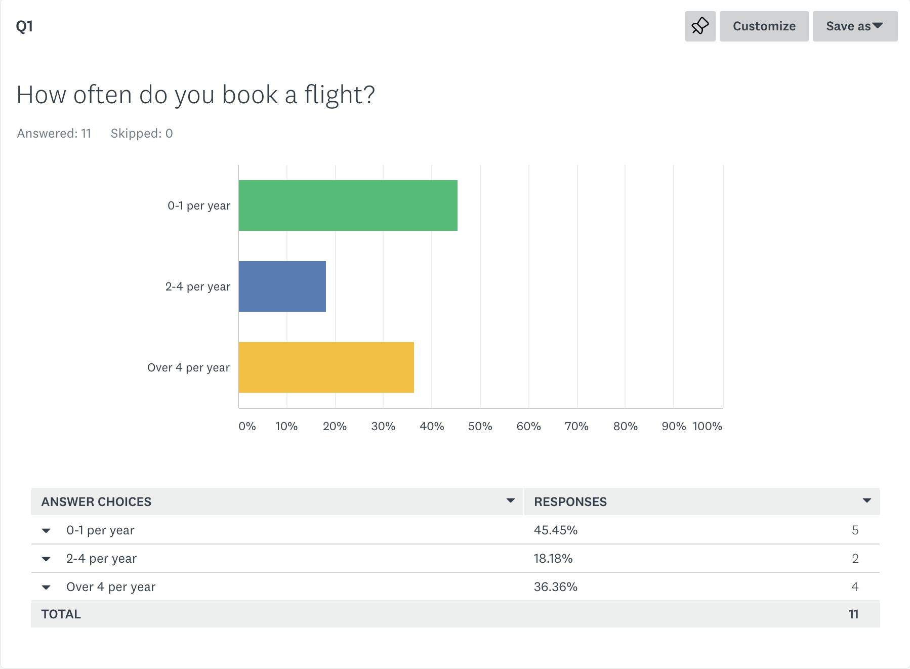
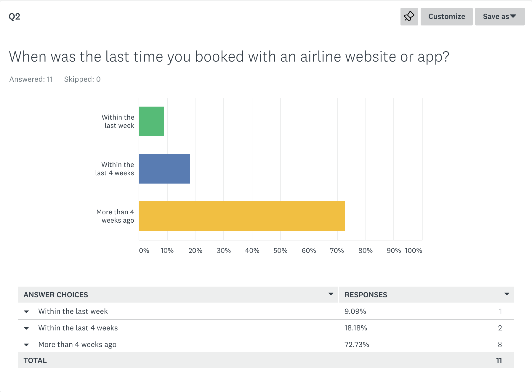
I conducted an online survey consisting of quantitive and qualitative questions, to find out more about the goals of airline customers, what they are trying to do and what might be preventing them from doing it. To conduct the survey, I used survey monkey as it allows for open and closed questions along with different types of graphs to allow for a variety of questions and results.
By doing the survey I gathered some valuable information that I will take with me throughout the design process. I found that often common traits would appear that users either liked or disliked about using an airline booking system. These traits are incredibly important to consider in the design as they are what the users feel most strongly about, whether it’s a convention I should follow or it’s a problem to solve.

“Less is more so less reading more pictures - for example rather than the word “luggage” a photo of luggage with the weight is easier than reams of text explaining what you can and cannot do.”
Depth Interview
I carried out a depth interview to understand and learn more about the context of use of people that use airline websites, what they are trying to do, who they are with, where are they and what devices they are using. I chose to do the depth interview before I carried out the usability test as I felt it would be a great way to relax the participant and get them into a more conversational mode.
Through the interview I learnt many things, such as the importance of trust when booking a flight. I picked up that the participant often made comments to do with trust, such as, they choose to use particular airlines as they are reputable, for the security, safety and protection if anything goes wrong. Other factors that backed up the results from my survey were that the most important factors when booking a flight were the price, date and time and the airport, the participant would always fly from the closest airport to home.
The interview helped me have a greater understanding of what is most important to the user when booking a flight and highlighted even further points i should take into consideration when I start designing.
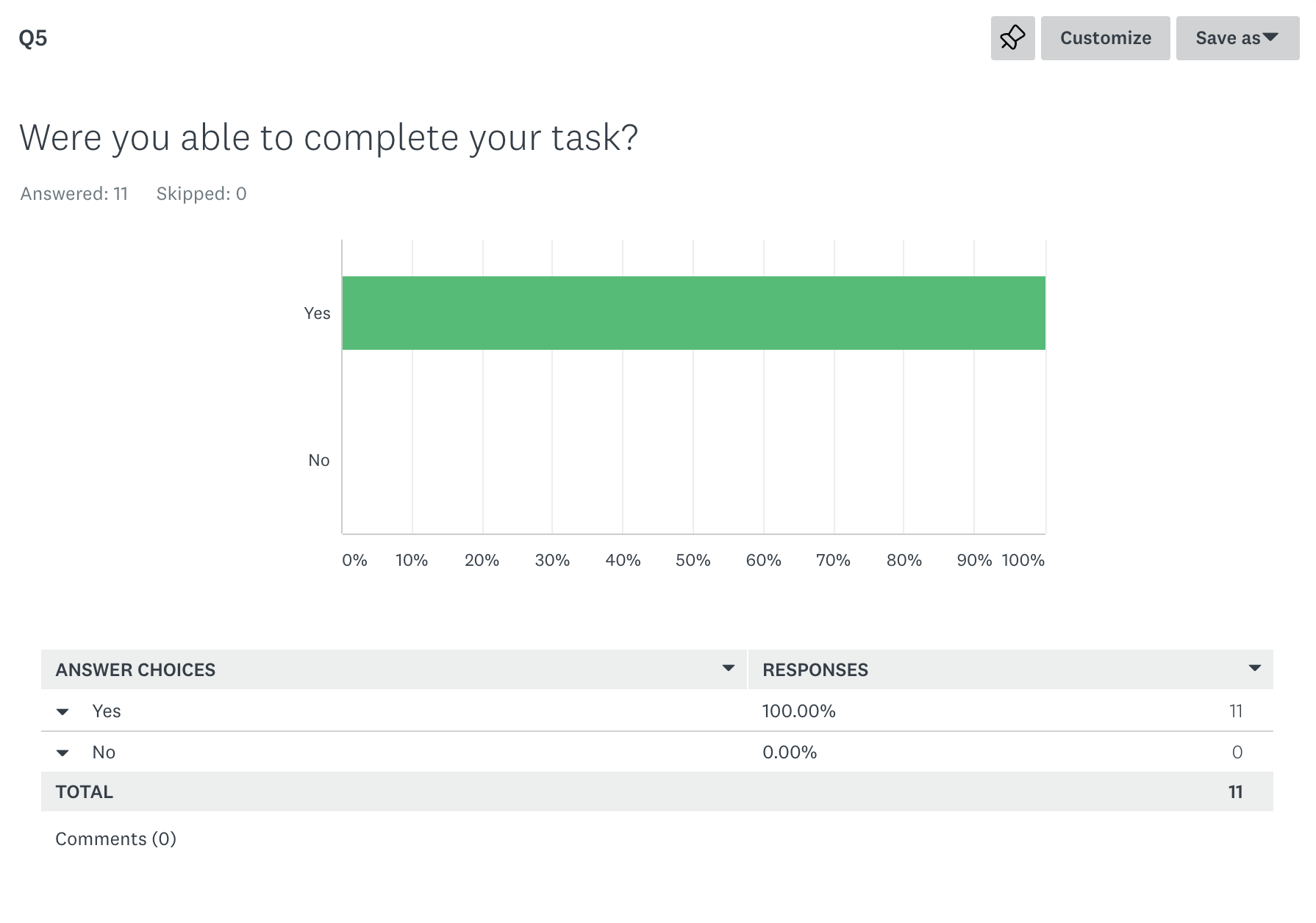
Usability test
After the Depth interview I then asked the user to perform a usability test on two websites explaining what they needed to do. I chose to use EasyJet and Skyscanner as my tests because they were the top used websites from my survey. Testing these would give me a greater insight as to why the majority of my participants used these websites, what they found so great about them and what they found more challenging. By doing this I would be able to emulate what they do well, in to my design, and solve any problems that user comes across and consequently design and even better product for users.
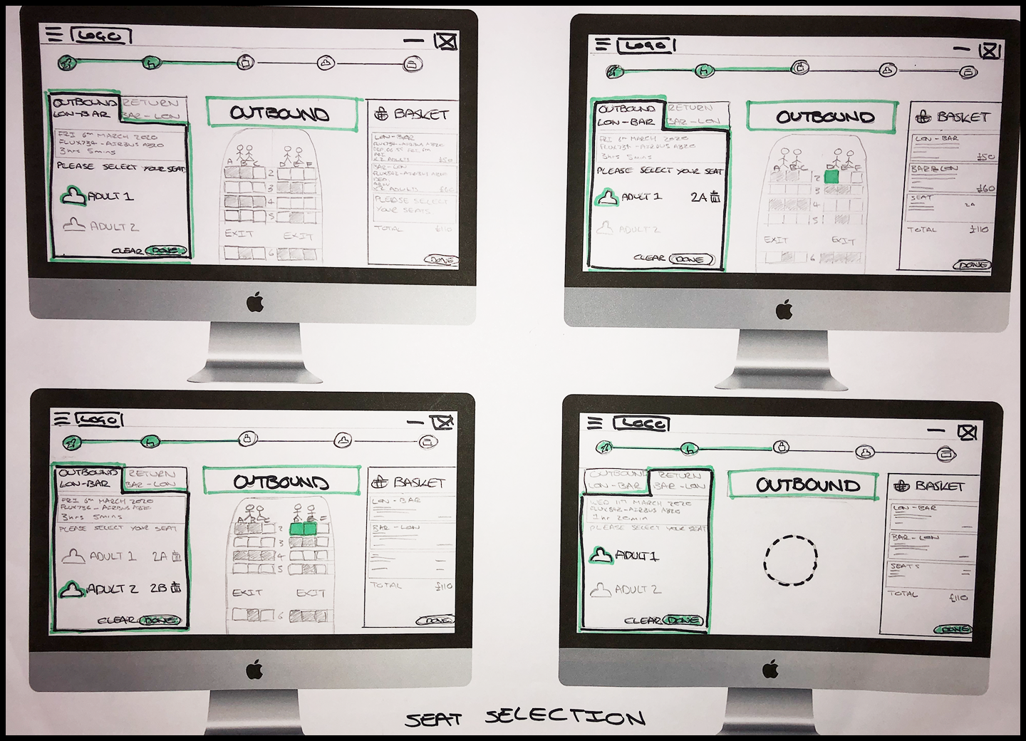
From doing my first usability test i’ve understood how much insight it can give you into the user, as often you can gain insight just from a facial expression or understanding a different mindset to your own. Something that I was particularly surprised by as it had never crossed my mind was the participant found it particularly important to know what type of plane she would be flying on, this would make a big impact on whether she would want to fly on that plane (for safety reasons) and also what seat she would choose. Another important aspect of choosing a seat is how long the flight is, this could change depending on if it is a short flight or a very long flight. Overall I found doing this research greatly impacted my design process and thinking.
Analysis
Affinity Diagram
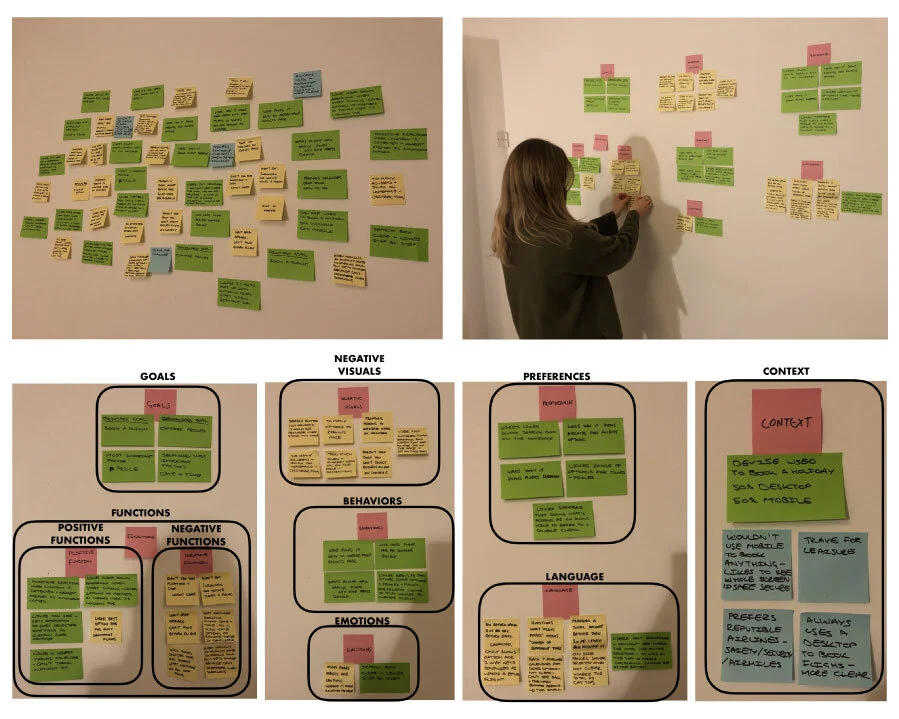
Once I had concluded the research phase it was time to organise all the unstructured data I had collated, to start to make sense of it all and ultimately create a document I could refer to, to help me in the design process and make sure I’m always considering what are the needs of the user. I did this by setting up an affinity diagram session (also known as the KJ Method) with myself and a friend. I gathered all my research which I shared with my friend, we then reviewed all the data and started the process of writing down descriptive notes that we felt were relevant to the improvement of the design, which we then stuck all the notes up onto the wall. The next step was the process of organising them into groups that seemed natural and regrouping until we were happy with them- Language, Context, Goals, Emotions, Behaviours, Preferences, Visuals and Functions. By the end we had gathered all the unstructured research data and had now created a structured diagram that made sense. This method was an incredibly helpful way of categorising and organising a large amount of fragmented data into logical groups, which enabled me to then create a customer journey map which is discussed in the next step.
Customer Journey Map
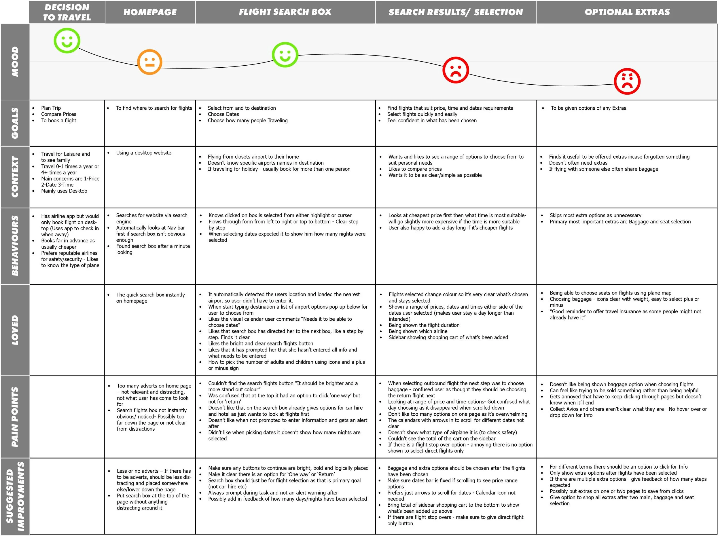
Next I created a customer journey map from the affinity diagram. It is effectively a diagram which visualises what the customer experience is as they interact with the product. I plotted out each stage of the booking process and then relating to each stage what the users Goals, Context, Behaviours, Pain Points and what my Suggested Improvements were. I also created a section for what the users “Loved” so I could keep in mind what was important to them and made a great experience. I then plotted out the mood of the user at the top to show a visual representation of the users emotions when at each stage of the process. This enabled me to visibly see the areas which users have the highest pain points and the most problems that need to be solved.
I found the customer journey map to be invaluable when designing, it created a highly structured document that was incredibly easy to understand and helped me to always think from the users point of view, I would constantly be referring back to it when designing. I was able to see how it would be a valuable document to share with a team, to be able to quickly convey all the research acquired and the needs of the users.
Design
Flow diagram
Now I was coming into the design phase I was ready to start thinking about the Information Architecture and making sure it matched with the users mental model. I did this by creating a high level Flow Diagram focusing on one use case, to book a flight on the new airline website FlyUX from searching for flights through to seat selection. In reality I might need to design multiple flows to ensure I have covered all the major use cases.
I had done all the research before hand which gave me an in depth insight to the problems of the users and also what worked well, so I had a good understanding of what needed to be included in the design. Then mapping out the Flow diagram helped me to uncover what screens and screen states were needed to help solve those problems and what I should include that worked well. I designed the flow diagram multiple times with pen and paper referring back to my customer journey map to make sure i was addressing the issues that had arisen. I then finalised my design digitally using Sketch.

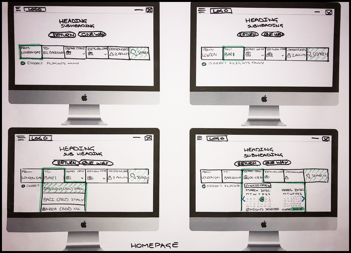
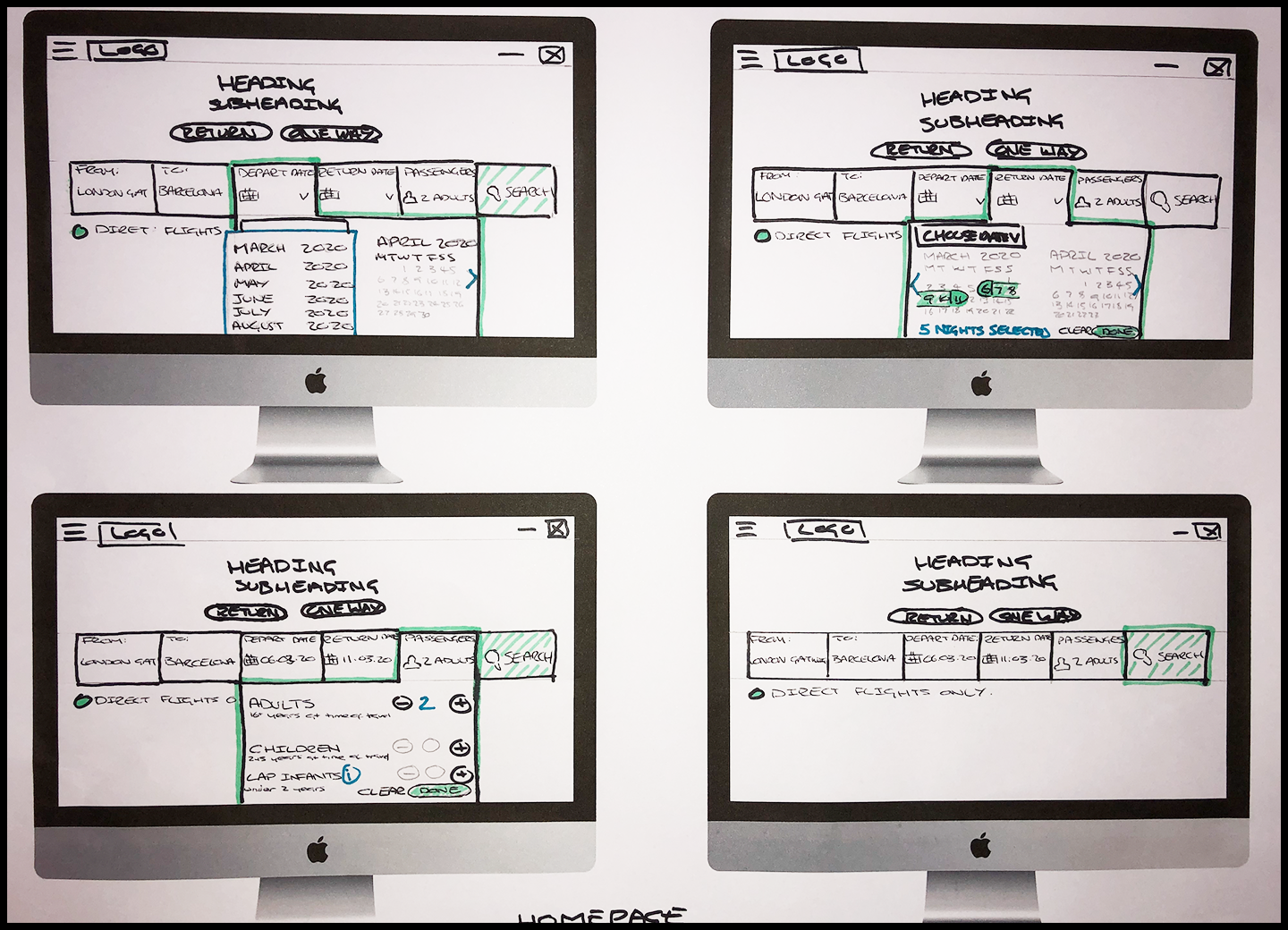
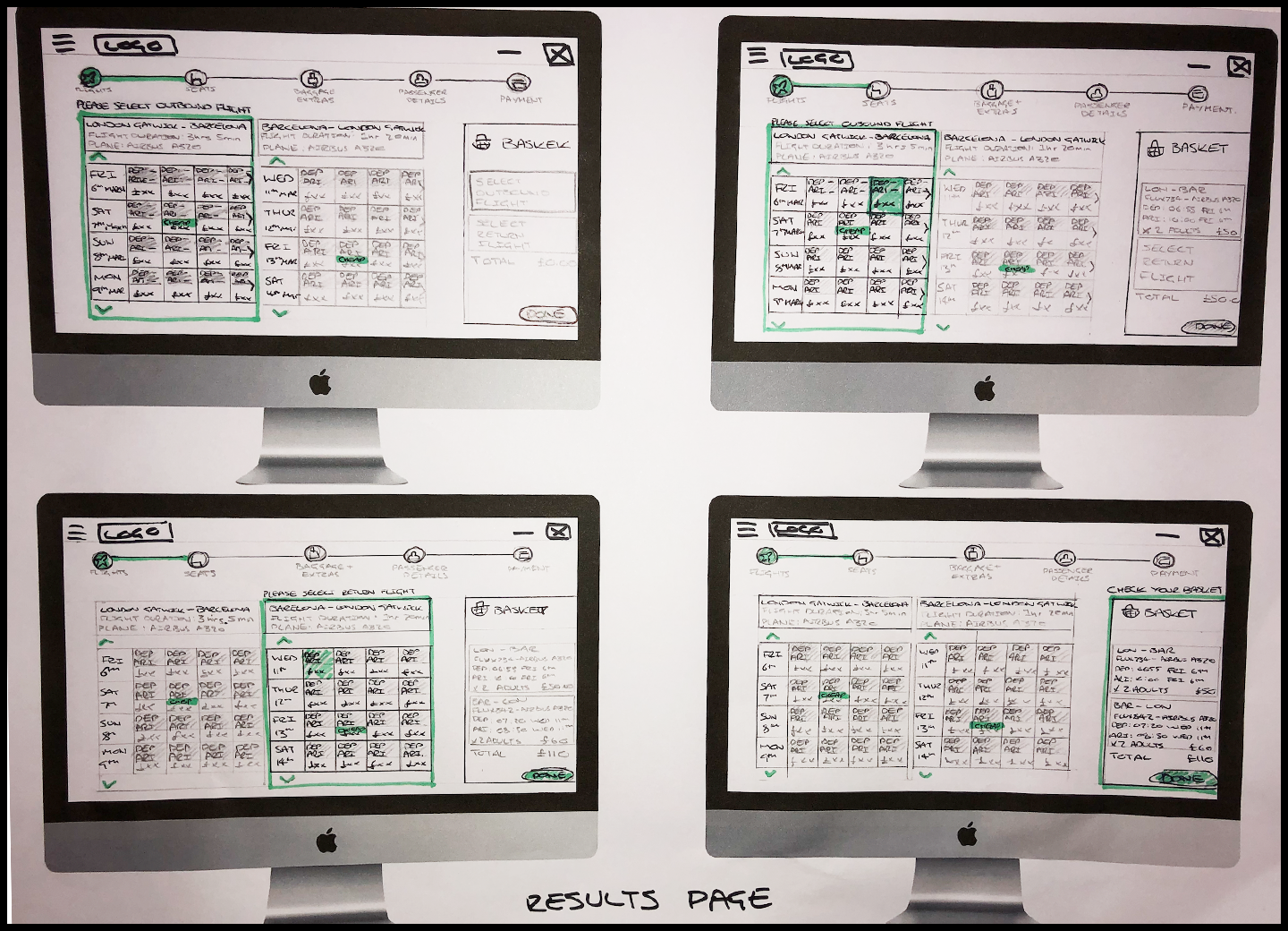
Sketching
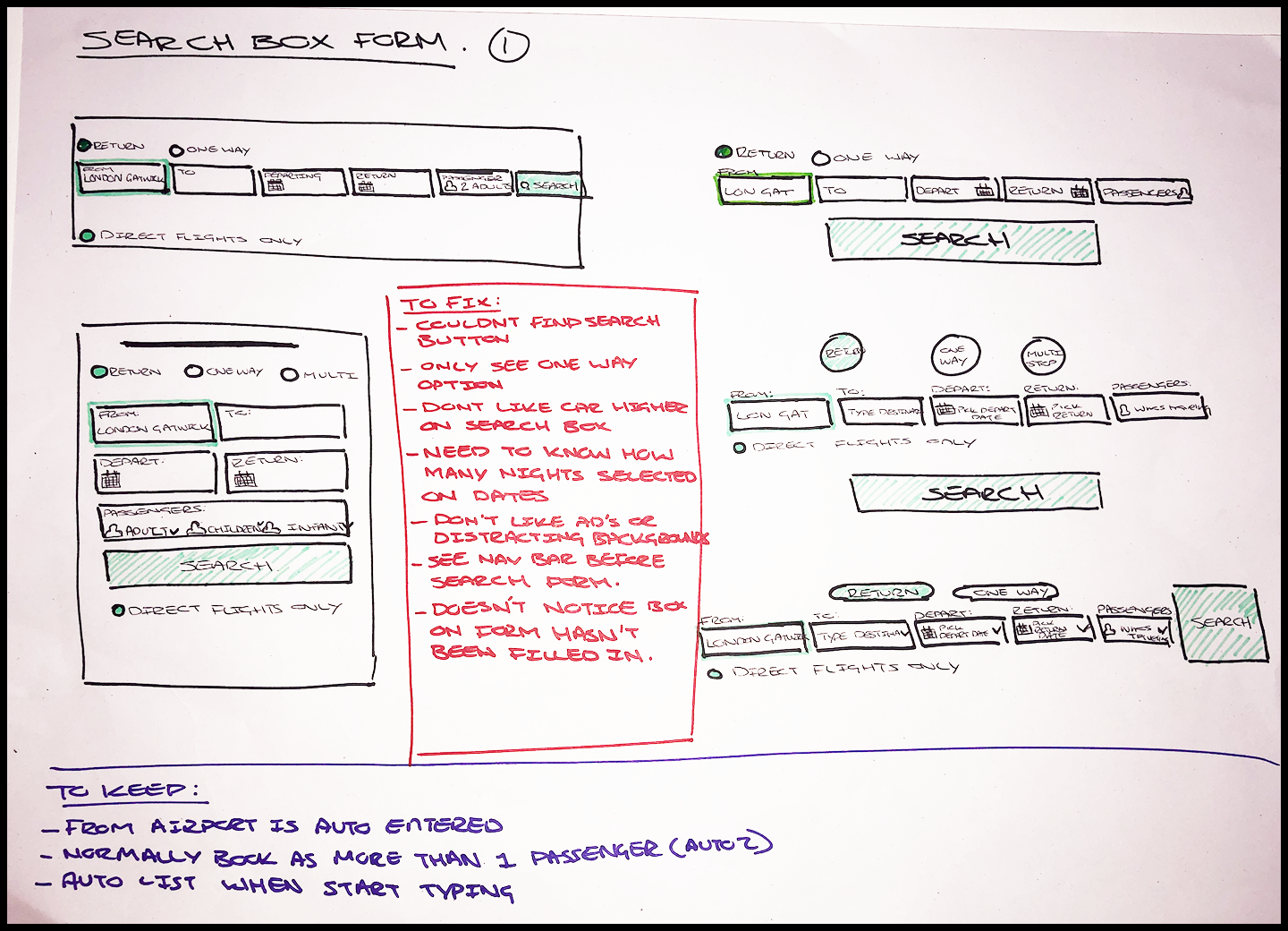
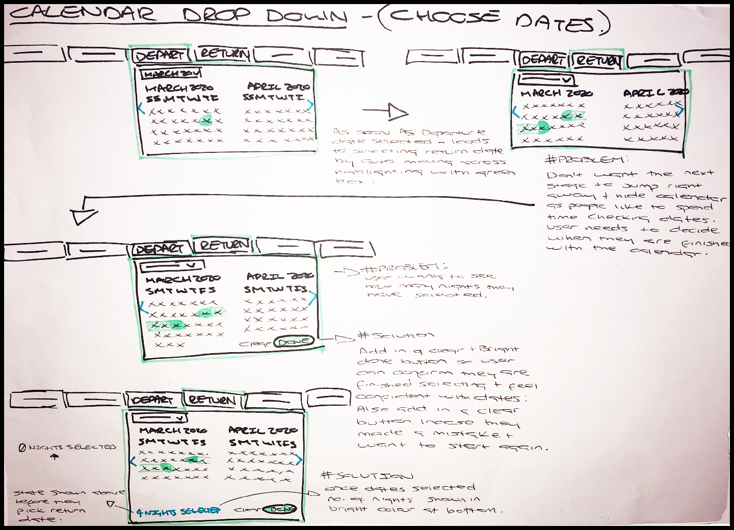
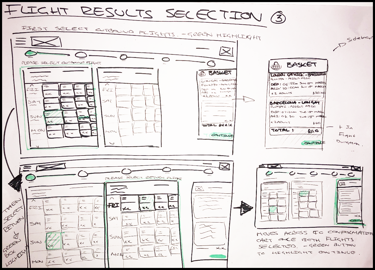
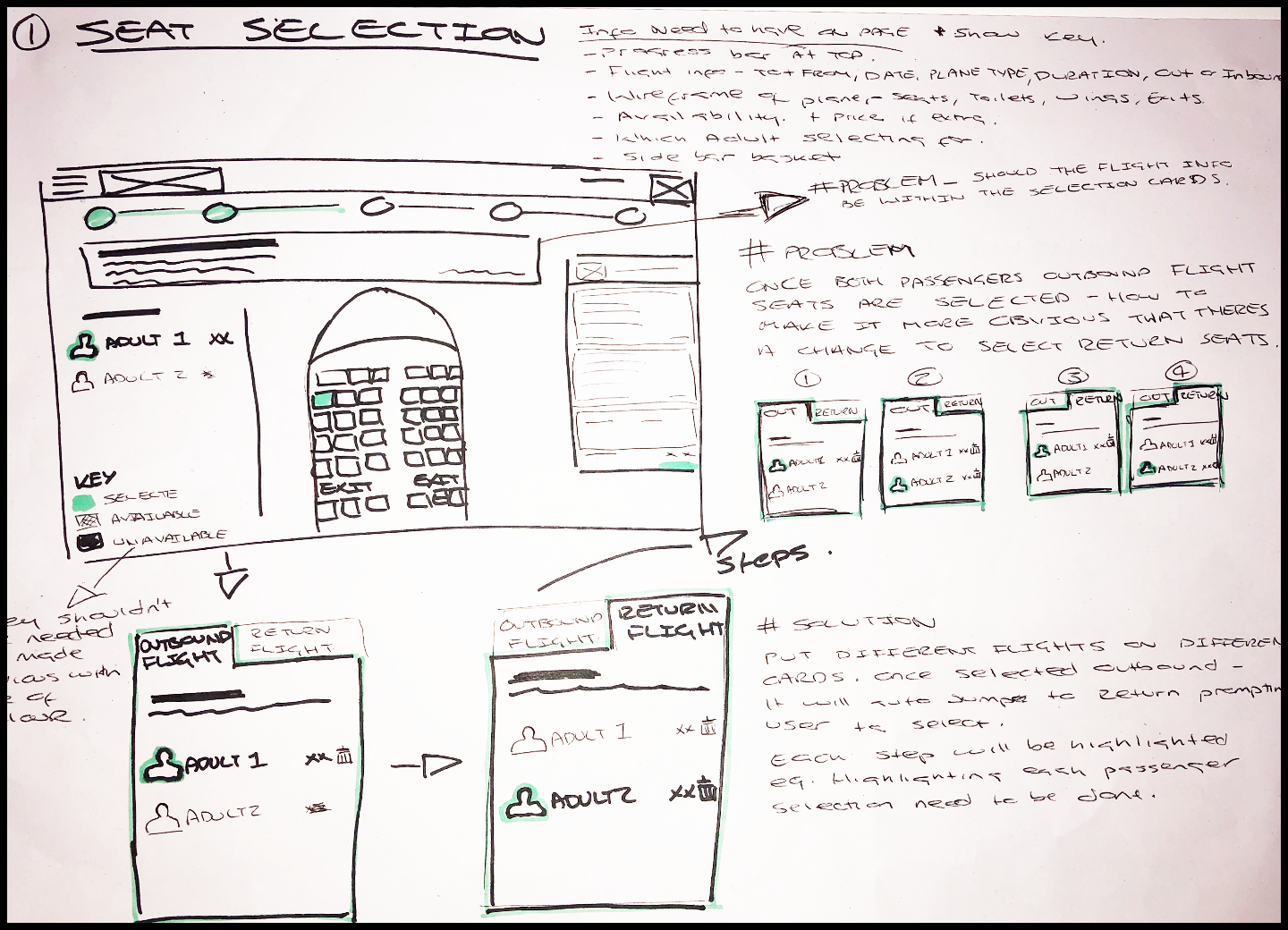
Now I had a strong understanding of the problems and I understood the flow of the website, I was ready to start sketching out what it would actually look like. I started the sketching process with low fidelity sketches using a pad and a pack of sharpies. I looked at each step in chronological order of the entire flow and really sketched and developed every single step, how each drop down will work and the best way to represent the different flight options. By doing this it really helped me to see any problems that occurred in each component, so i could develop it further into what I felt was the best possible solution. When doing the initial rough sketches I would note down the problems the user had at this point referring back to the customer journey map, to keep in the forefront of my mind what problems I needed to solve for the user. I wanted to really think about the process rather than each screen in isolation.
I found the whole process incredibly helpful in working out solutions, It really helped to visualise the solutions in a very quick way rather than trying to work it out digitally. My main objectives when designing:
“Don’t make me think”
I wanted the design to really lead the user through a step by step journey and making it so they don’t have to guess or think what they have to do next.
Keep it simple
I also wanted the user to have all the information they needed at each stage whilst still keeping everything else simple enough they were not overloaded with information. Eg. When the user came to choosing their seats, I made sure the type of plane and the length of flight was visible as that affects the decision of what seat they will choose.

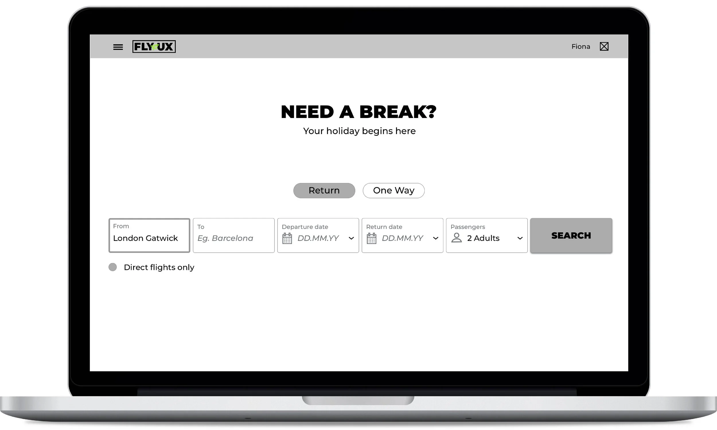
Prototype
Following on from the sketches I then created the medium fidelity mockups using Sketch, which I could then use to test the interactivity in a prototype. I kept it all at greyscale to really focus on the flow and interaction of the design. Rather than concentrating on the aesthetics such as colour, I concentrated on just creating one user flow to understand how well the end product would lead the user through the process, from searching for flights to seat selection, rather than getting too involved in making every interaction work.
Once I was satisfied with my mockups, I was able to export them all and build my medium fidelity prototype using InVision. I found this tool to be incredibly helpful, it really helped me to visualise the interaction, which until this point was hard to do even through the use of the flow diagram and sketches. I found once I had built the prototype that actually I could remove a couple of small steps that didn’t add any value to the user and actually meant that they had to make a couple more selections than was really necessary. Once I was happy with the design I then had a prototype that could help verify if the solution works for the users or not.
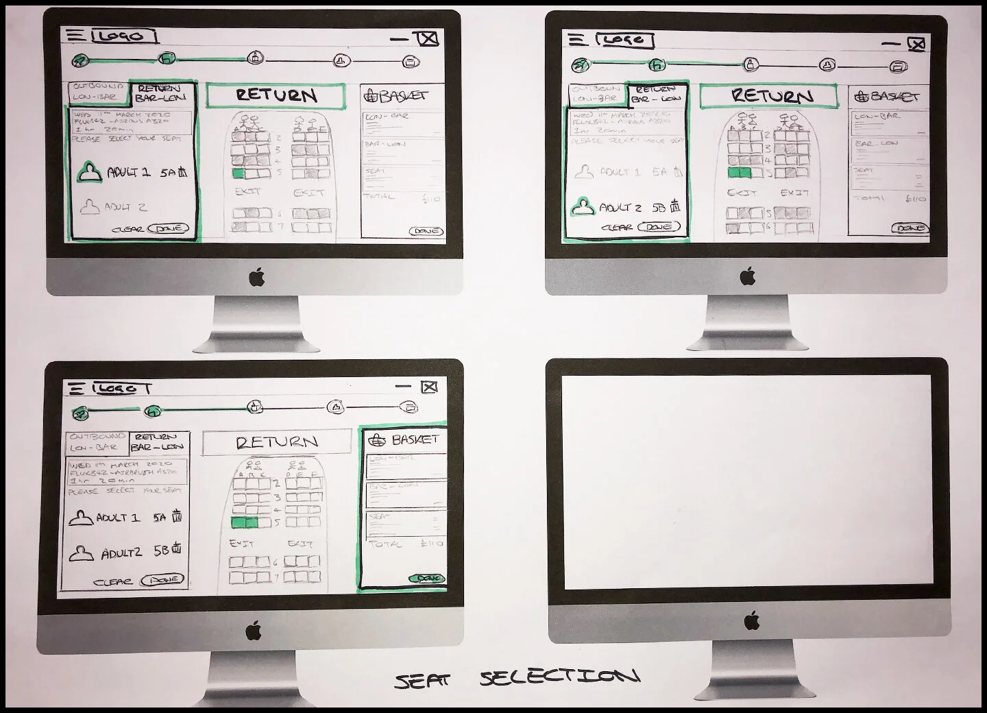
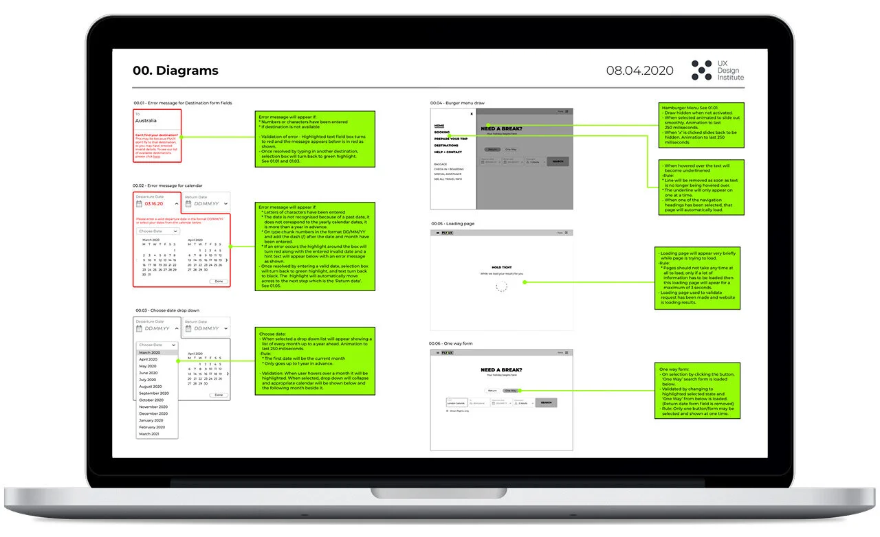
Wireframes
For the final stage it was time to create the wireframes with all the in depth details to allow a developer to build the website accurately. I made annotated notes next to my mockups to define the functionality and behaviour of how the product should work, I made sure to specify the controls, rules and any feedback.
I again found this process to be incredibly helpful and important in the design process. By looking at every single aspect of the design and really thinking about all the possible scenarios and rules in fine detail, it really highlighted a few small details I had missed out in my initial sketches and needed to add into my wireframes, as discussed below:
Calendar drop down - Does not need a back arrow if it is already on the current month as can’t go back into the past. The arrow needs to be made invalid at this point.
Calendar drop down - Needs hint text in the form field (DD/MM/YY) to show users how it should be written if they choose to type in the date.
Calendar drop down - Need to make all previous departure dates from what has been selected invalid as the user may not chose a date previous to return on.
Calendar drop down - Need to remove clear button when no date is selected as there is nothing to clear.
Seat selection - Should the user click to 2nd passenger or should it be automatic incase they want to amend their selection? This would be interesting to test on the prototype.
Conclusion
This project was the main practice part of the Professional Diploma in UX Design, by the UX Design Institute accredited by the Glasgow Caledonian University. Along with the theory side I have truly enjoyed and learnt so much, I have been taken through the whole UX design process from beginning to end and have come to truly appreciate what UX design is all about.
With a background as a graphic designer, it has really opened my eyes to exactly how much thought and work goes into a design before it gets to the aesthetics side. I have found that UX is a problem solving and research based discipline and that a great product consists of functional design, experience design and also aesthetic design.
I have loved the whole experience and found it to be really rewarding to know that you can make that little bit of difference by making someones day a little easier, through a design that was made and built to do just that.