
Introduction
Overview
Simulate is an extension that is available to be integrated into any potential clients sports books. It allows their customers to place virtual bets on soccer events that are found on the clients sports book.
The Problem
Simulate originally started off as a mobile design, it then needed to be adapted for a cashier and self service screen for a betting shop in Nigeria. The first version of the designs for this were not made to be adapted for a desktop size. Therefore the designs needed to be updated and redesigned. Following on from that a full Design system needed to be created as there wasn’t one currently (A write up on this will be coming soon).
My Task
To design the update for mobile and make sure it works across the cashier and self service design.
This included looking at:
Colours
Typography
Components
Variants
My Role
Design V2 update for the current
mobile designDesign for desktop specific
(Cashier + Self Service)Build out components
Build Prototype
Timeline
Ongoing
Skills
Component and Variant creation
Desktop and Mobile Design
Prototype
Tools
Figma
Kap (Screen Recorder)
Mobile Design
Before + After
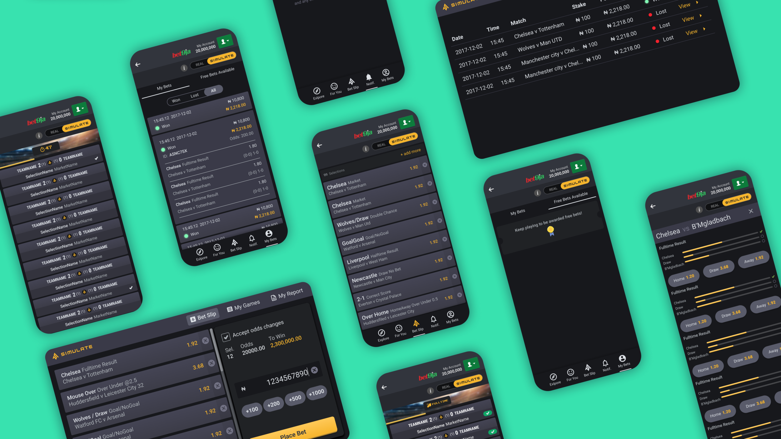
Below are some examples of what the Simulate Mobile Sportsbook looked like in Version1 and then what it looked like after I had re-looked at the designs. Please click on the images to see them at a larger scale.
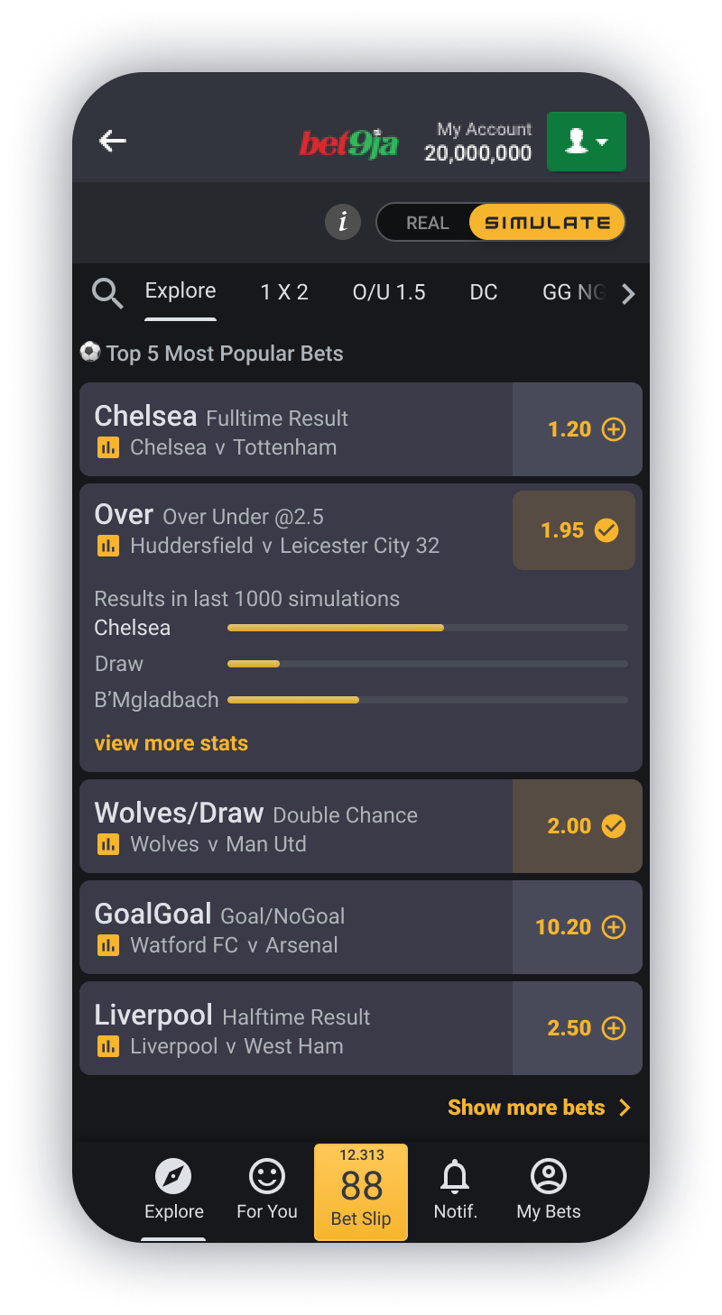
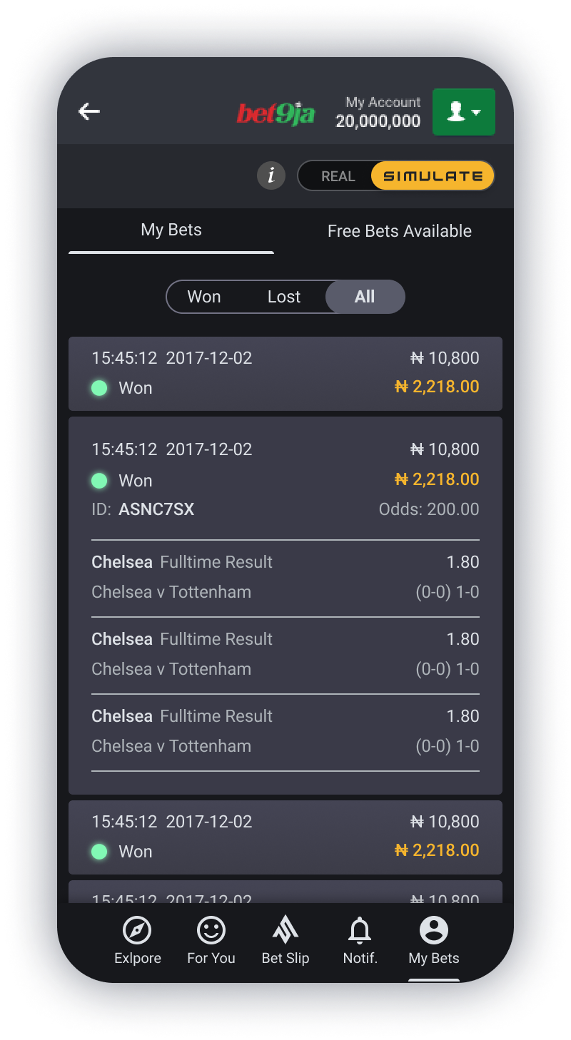
Betslip Page
The problem in the original design was that a lot of the page real estate was taken up by the navigation, and the place bet selector at the bottom. This meant the user wasn’t able to view as many of their betslip items. It also appeared quite cluttered.
The solution was to firstly move the navigation to the bottom, so it was more user friendly to quickly access (considering Fitts's law). The Bet slip navigation icon acted as a link that when on the actual bet slip and selected, the view would jump down to the bottom of the page and show the bet slip selector. This meant more Bets could be shown on the page and make it much less cluttered.
I then also tweaked some of the colours to give it a more modern feel, adjusted some of the font size to be slightly larger and tried to simplify the design slightly.
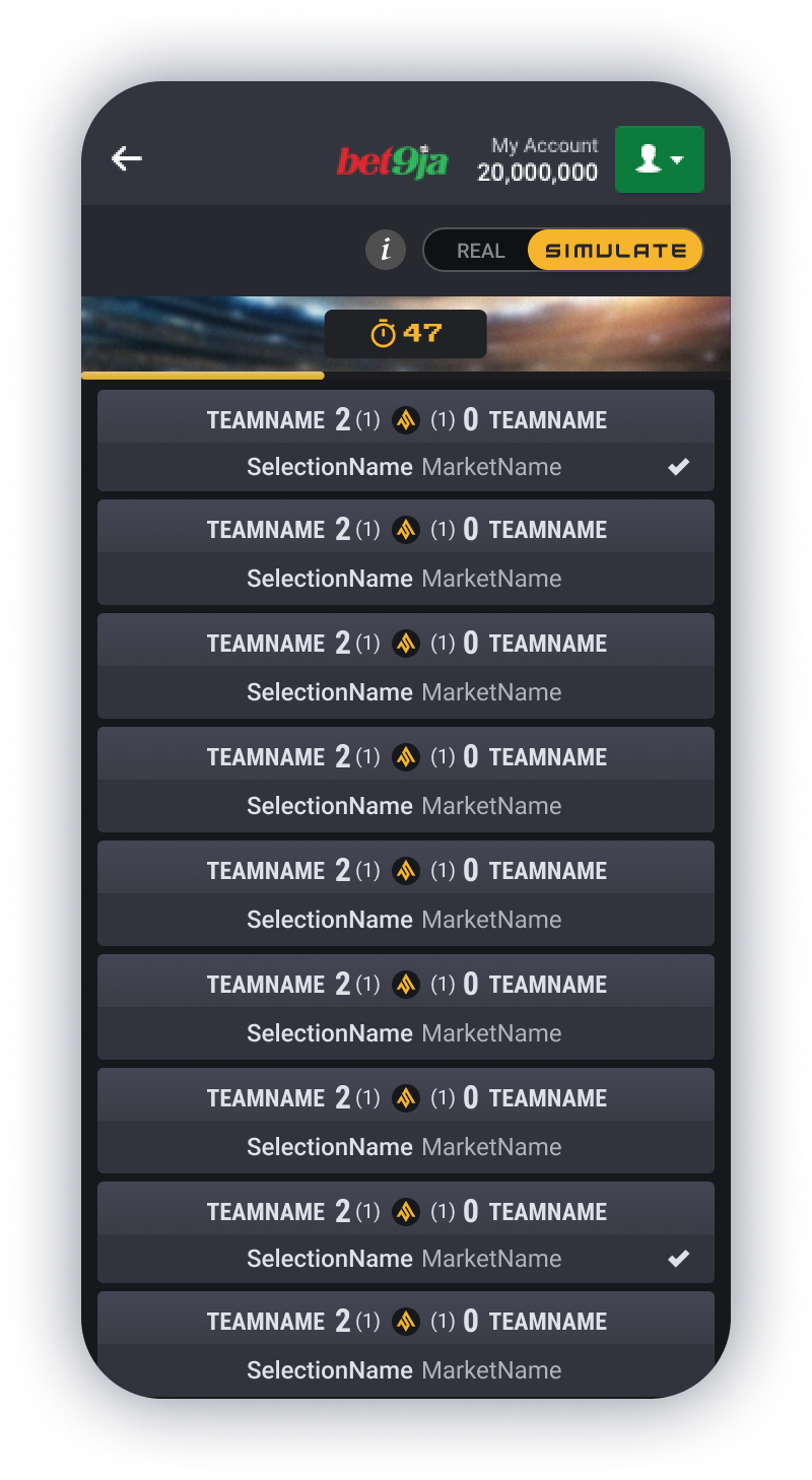
Game Result Page
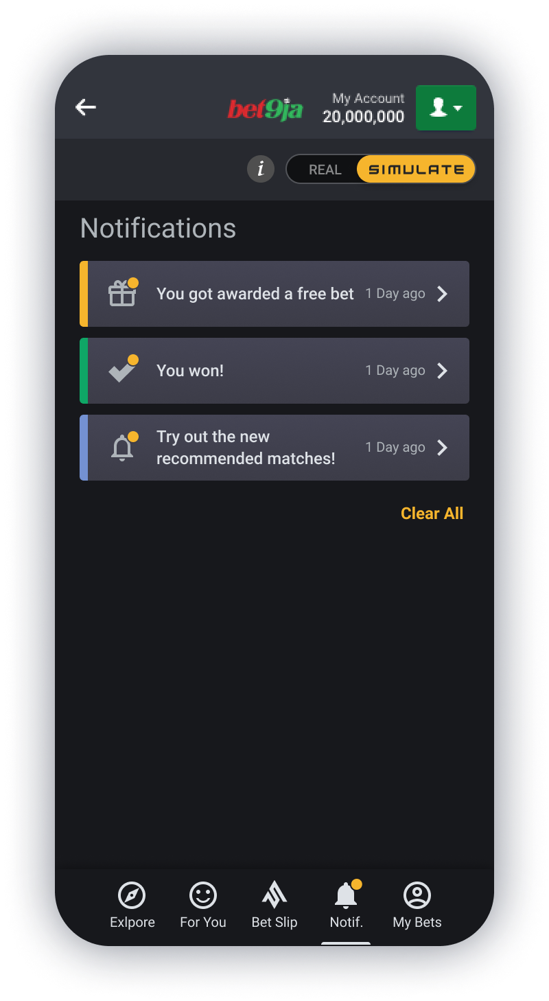
The problem in the original design for this page was that a lot of the page real estate was taken up with the navigation and the green WON notification section at the bottom. It also wasn’t entirely clear which bets had won with just a tiny tick showing next to them.
The solution this time was to remove the navigation from this page, as it was not necessary. We only need to provide the user with the information they need at the time. In this case the user needs to decide if they would like to re-bet or if they are done. If the user selects done, then the page will go back to the Explore page (Home page) where the navigation is again visible. The “You Won” notification was made much smaller and kept to the styling of being left and right aligned rather than centre aligned making it look much neater and again showing more of the bet slips.
Finally to make it more obvious which bets had won, I placed a slightly larger tick in a green oval shape that was right alined. The green stood out quite clearly against the Grey background, matching the “You Won” notification at the bottom, so they are quite clearly related. For accessibility, colour should not be the only signifier for winning, and so the larger tick and the notification at the bottom which also replicates the tick and the words “You Won” is there as well.
Final Mobile Designs
Desktop Design
Before + After
Below are some examples of what the Simulate Desktop Sportsbook looked like in Version1 and then what it looked like after I had re-looked at the designs. Please click on the images to see them at a larger scale.
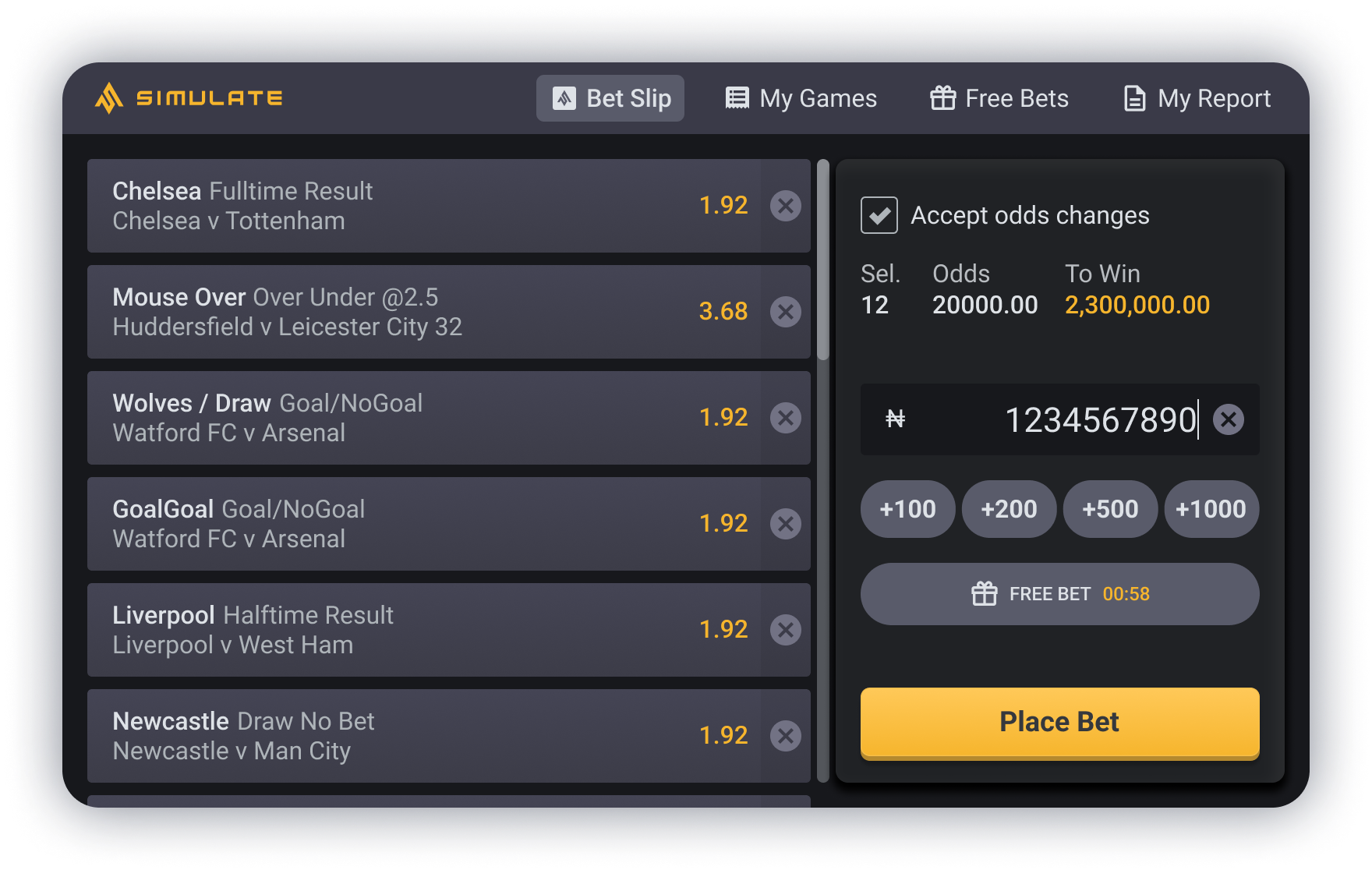
Betslip Page
The Problem in the original design was that it was not specifically built for desktop, the components used were resizable so they could stretch across to a desktop size. However, this meant that the bet odds were really far away from the match which makes it difficult to read. The Place Bet selector placed at the bottom also meant that not as many bet selections were visible to the user, which could be frustrating.
The Solution I came up with was to rearrange the design so it worked in a landscape form. There was a lot of wasted space with the full width bet selections, so moving the Place Bet selector to the right of the screen meant that firstly, the bet selections weren’t as wide and so the bet odds were much closer to the match which made it easier to read, and secondly that meant that almost the full vertical height was available and so more selections were visible.
My Games Page
The Problem in the original design it has a mobile format within a desktop size, meaning the font was incredibly small and hard to read, there was a lot of blank space around it, and it just appeared very out of place. Another point to note is that the screens they are shown on in Nigeria are quite old, and are not the best quality and so make it harder to read the text.
The Solution I came up with was to change the layout and view completely into a table format. This meant it could work with the full width of the screen making all the information clearly visible and labelled. This made it very simplified, so there wasn’t too much to look at all at once.
Final Desktop Designs
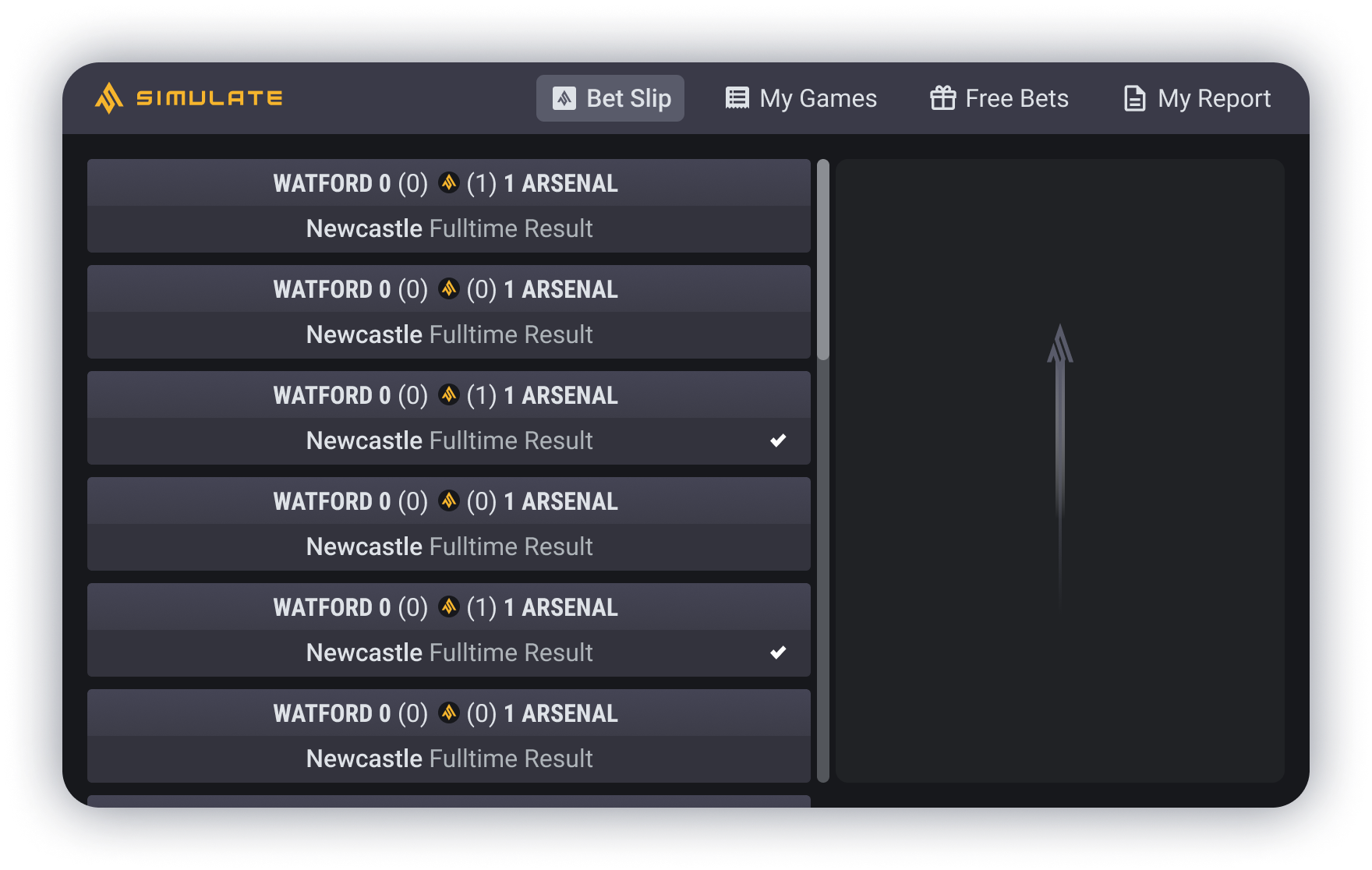
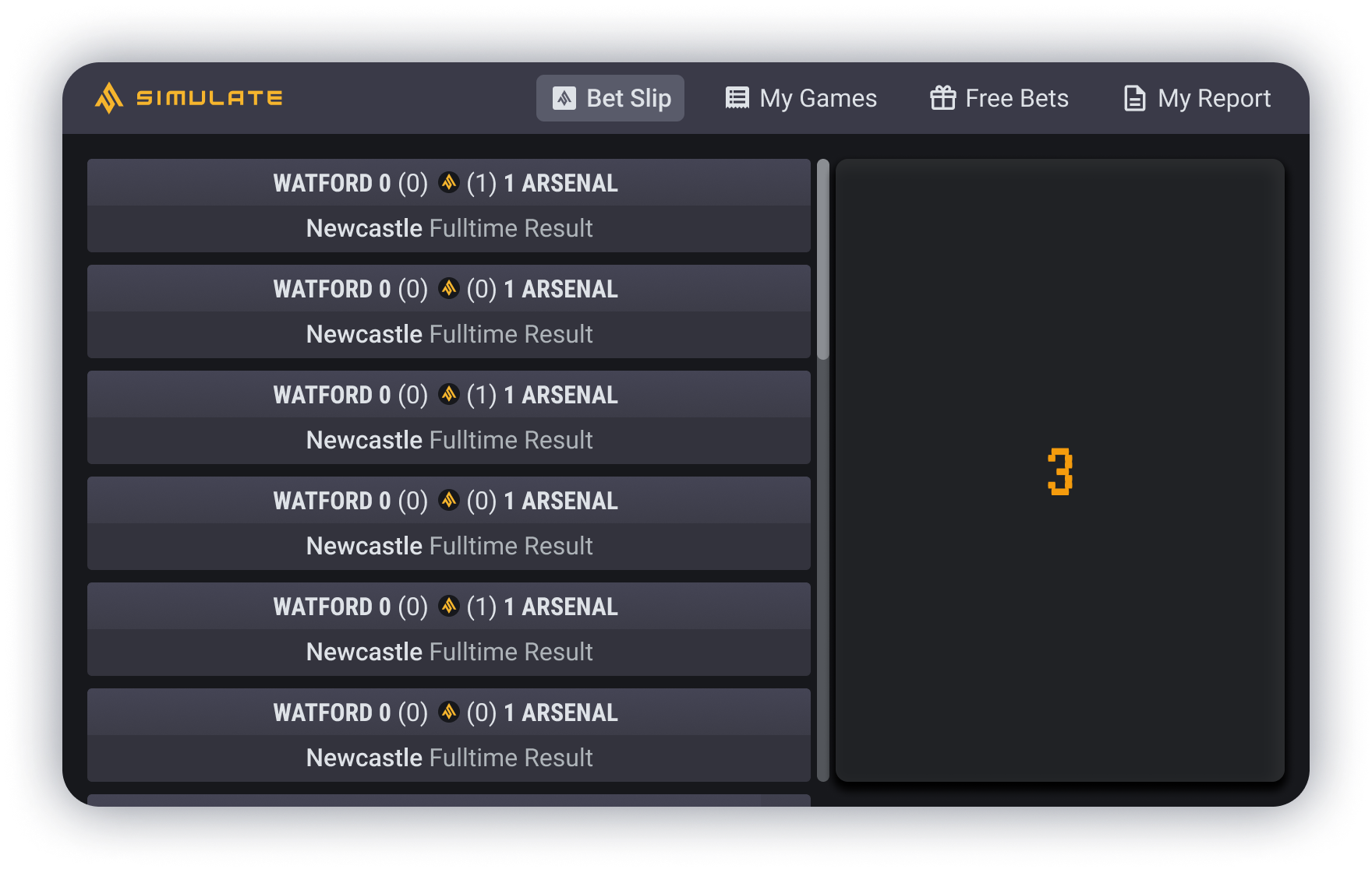

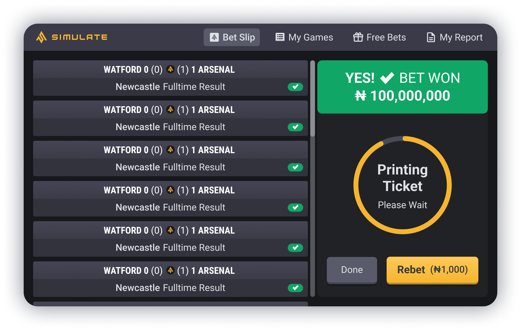


Prototype
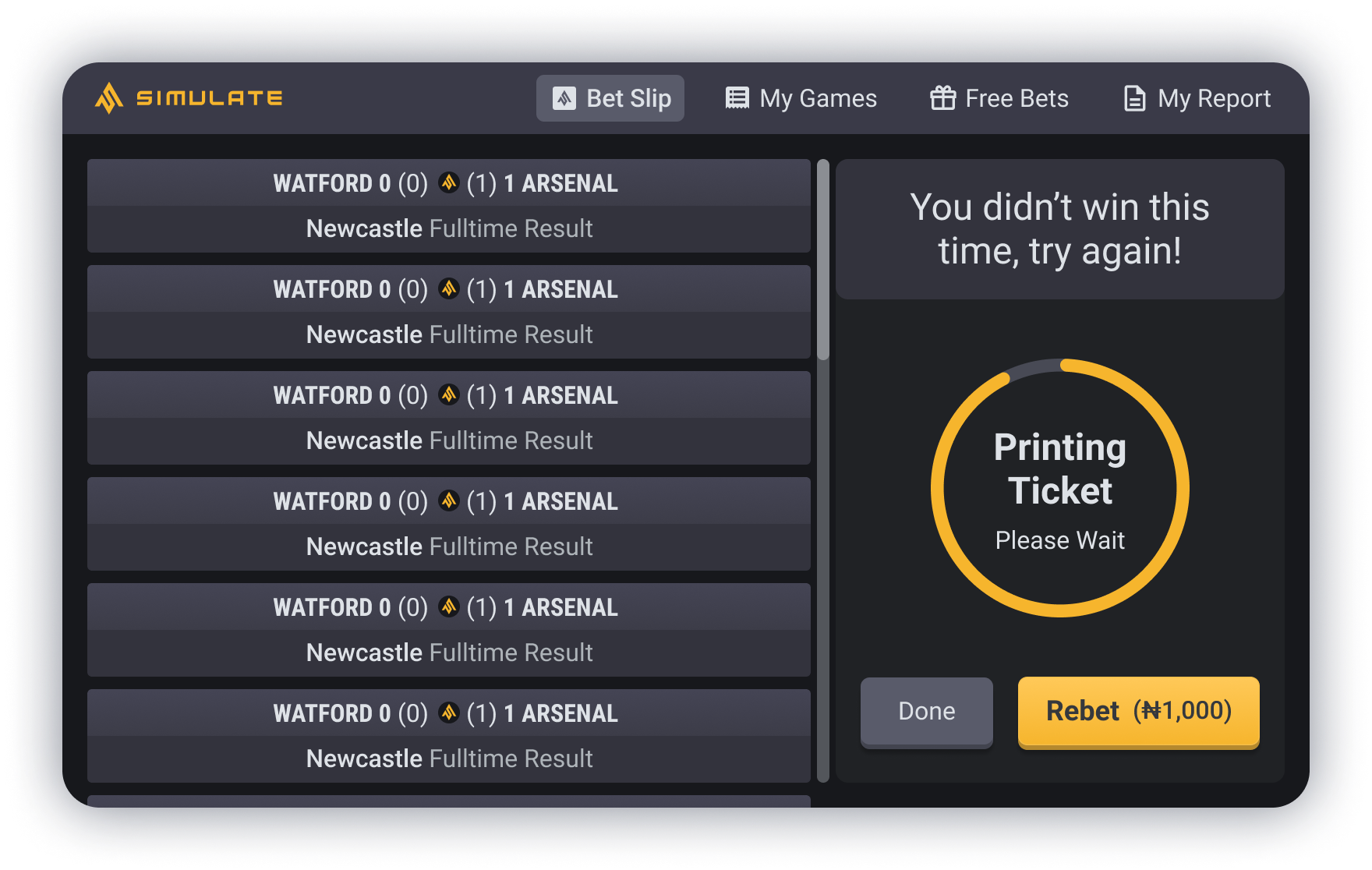
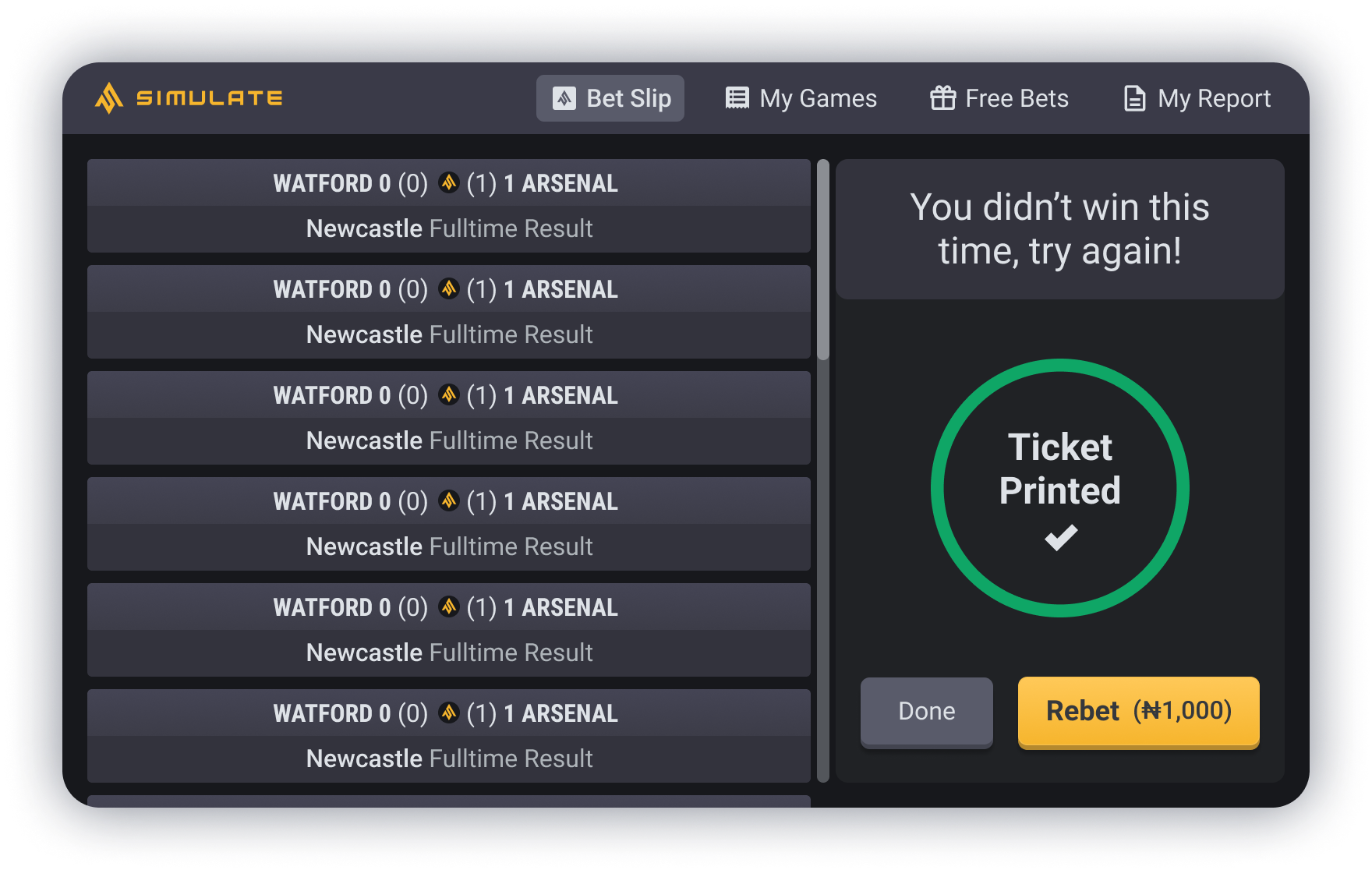
The cashier screen is where customers can go up to the desk and place their bets with the cashier employee, there is a screen that also faces the customer so they are able to see what the cashier is doing. As there are only limited cashiers, we didn’t want there to be a long queue of customers waiting, and so we decided to remove the game play element of the process and instantly provide the customer with their results. It was also requested that a "ticket of the results" always be printed to alleviate the trust element, for the customers placing their bets, with the cashier.
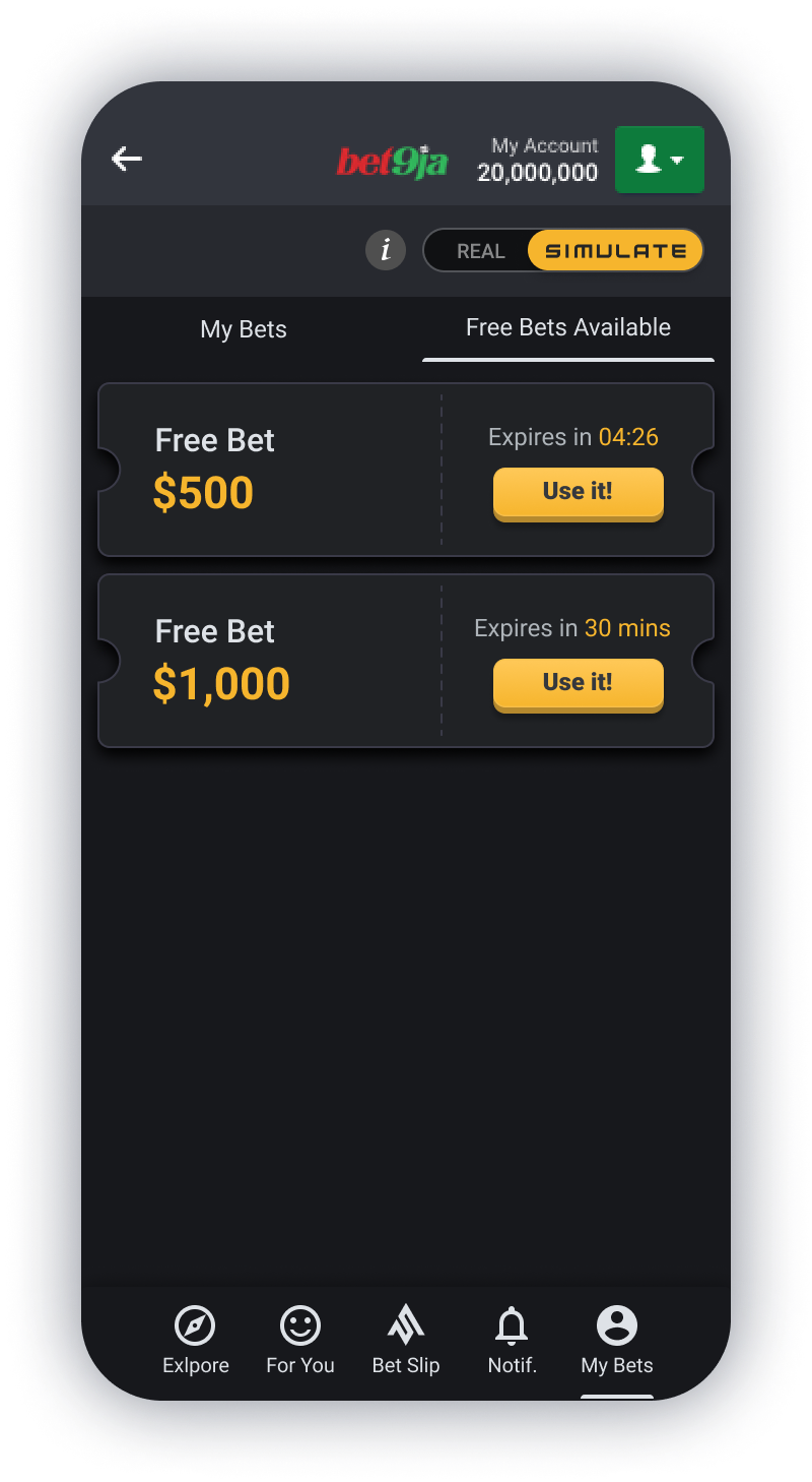
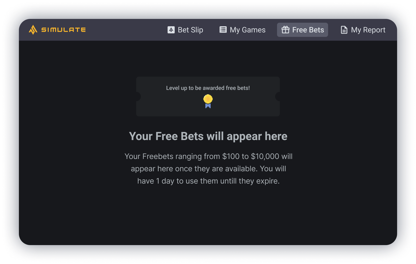
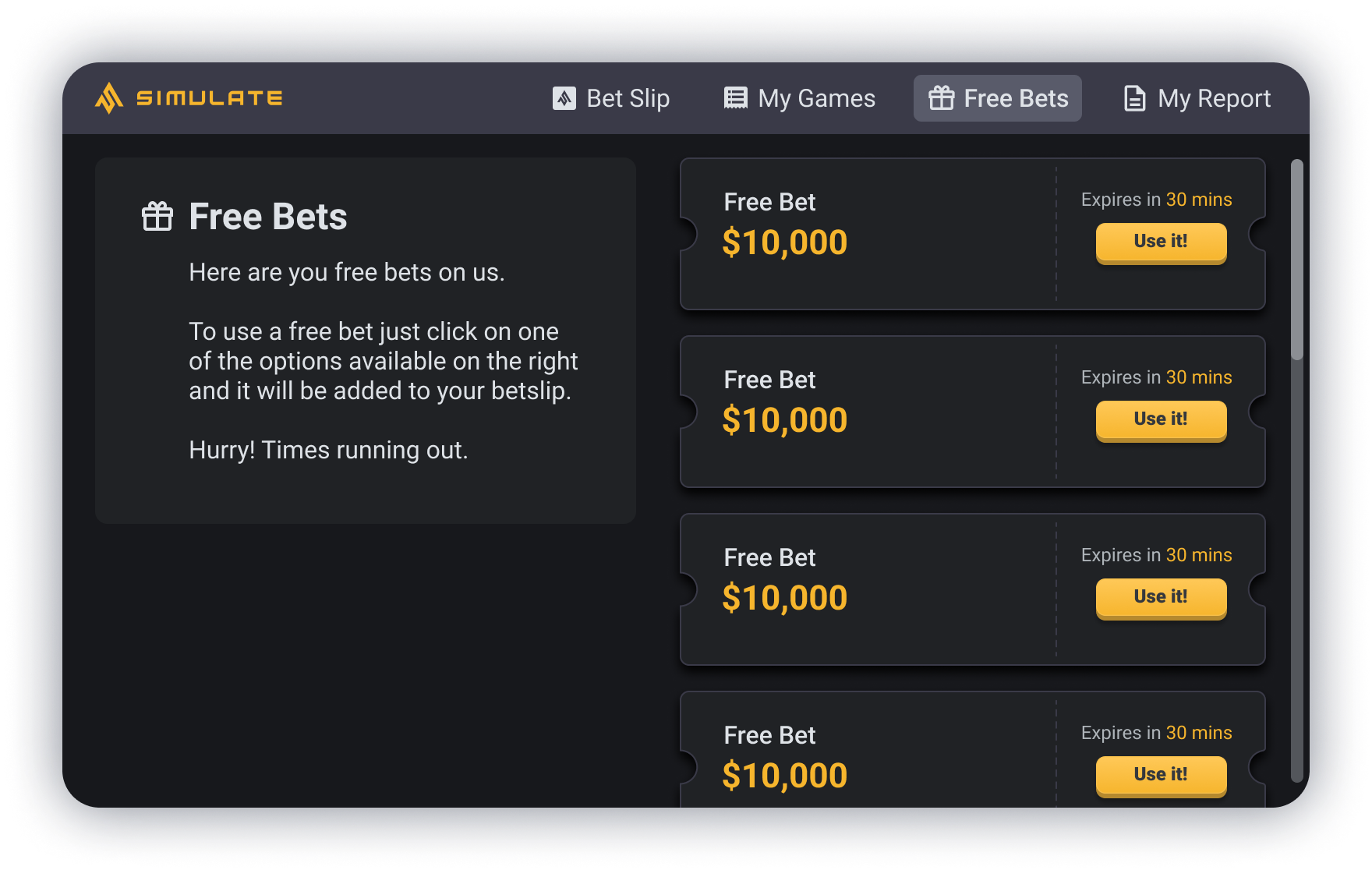
There are also self service screens where the customer is able to use and place bets themselves. As there are more of these screens and so not too much of a concern for long queues, this is where the customer will see the game play element, along with where the customer can look at their free bets that they have available.
I made a prototype of the cashier screen to show the full flow of placing a bet, the results being gathered and the ticket being printed which you can see in the video above.
Conclusion
Overall this project was really enjoyable to do, I enjoyed creating a more developed sports book and updating the design with a slightly more modern and simplified feel, along with redesigning the desktop version so that it was more considered and user friendly, especially considering the screens they are viewed on aren’t the highest standard or quality, so can be harder to read text on. The project was very successfully received with the stakeholders and developers. It is currently in the development process and so I am yet to see the feedback from the customers and be able to test my solutions with them. I will add an update as soon as I am able to.
From this project I started creating a design system for Simulate, as one didn’t currently exist. I am in the process of creating it. Once it is completed, the project will be available to view.